Overview
Curve Fit Analysis is a multivariate tool used to investigate the relationship between two parameters in exploratory processes. It uses linear least-squares regression and scatterplots, providing metrics like Pearson-R correlation coefficient and r-squared. It can be performed on Cycle and Part models, enabling high-granularity and lower-granularity comparisons. This data-driven decision ensures accurate predictions and efficient process optimization in manufacturing operations.
Before You Begin
Ensure you have:
Access to the Application tab
Permission to view selected assets or part types
Two numeric parameters available (X and Y)
At least 30 observations in the selected date range (100+ recommended)
Create a Curve Fit Analysis
1. Open Curve Fit Analysis
Navigate to the Application tab.
Select Curve Fit Analysis.
The configuration panel opens.
2. Select a Data Model
Select how you want the tool to group data:
Cycles – cycle-level parameters from the same asset type
Parts – part-level data across machines producing the same part type
💡 Tip: Use Cycles for equipment behavior and Parts for final product characteristics.

3. Select Assets
Choose an Asset (Cycles) or Part Type (Parts).
Select one or more assets of the same type.
Confirm selections in the left panel.
📝 Note: Using multiple similar assets increases data volume and regression stability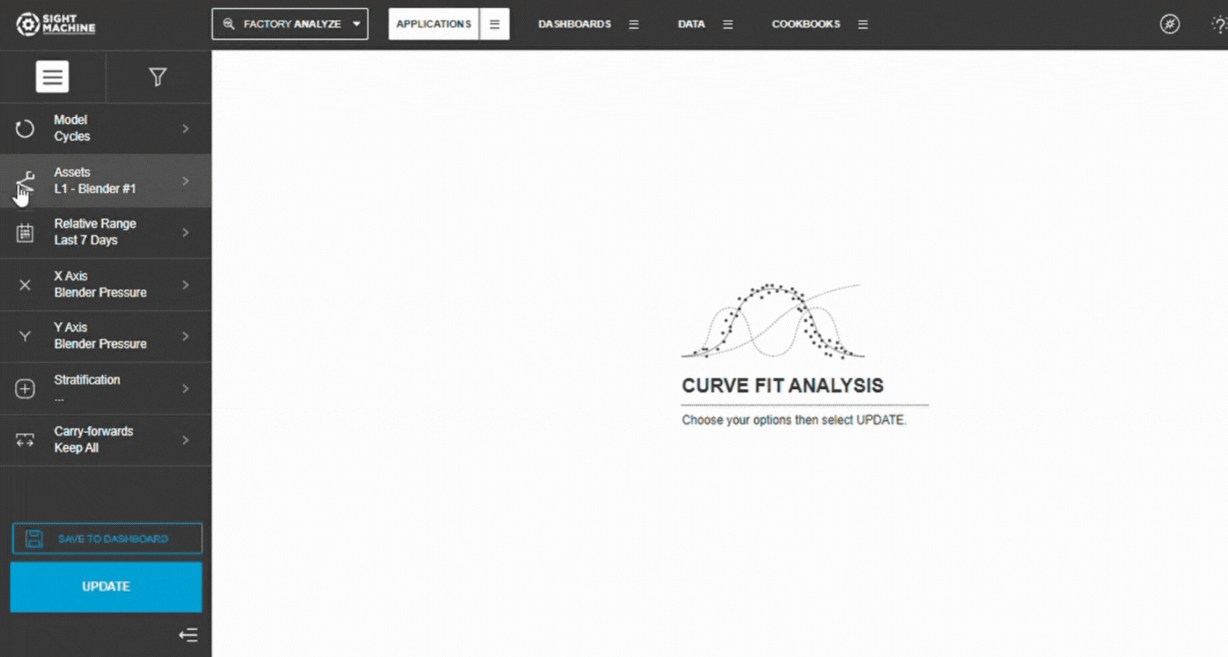
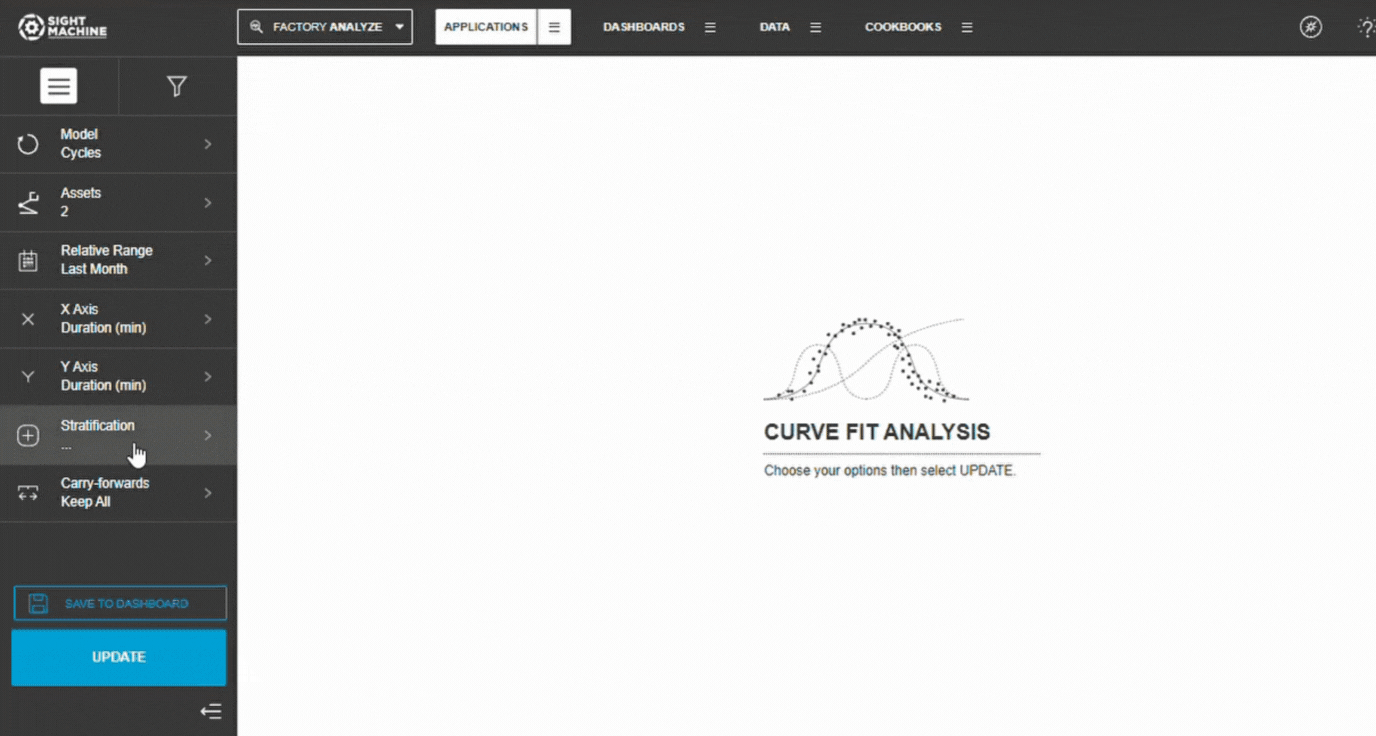
4. Set the Time Range
Choose:
Relative ranges (Last 7/30/90 days)
Absolute ranges (manual dates)
📝 Note: Larger ranges provide more data but may include process changes.
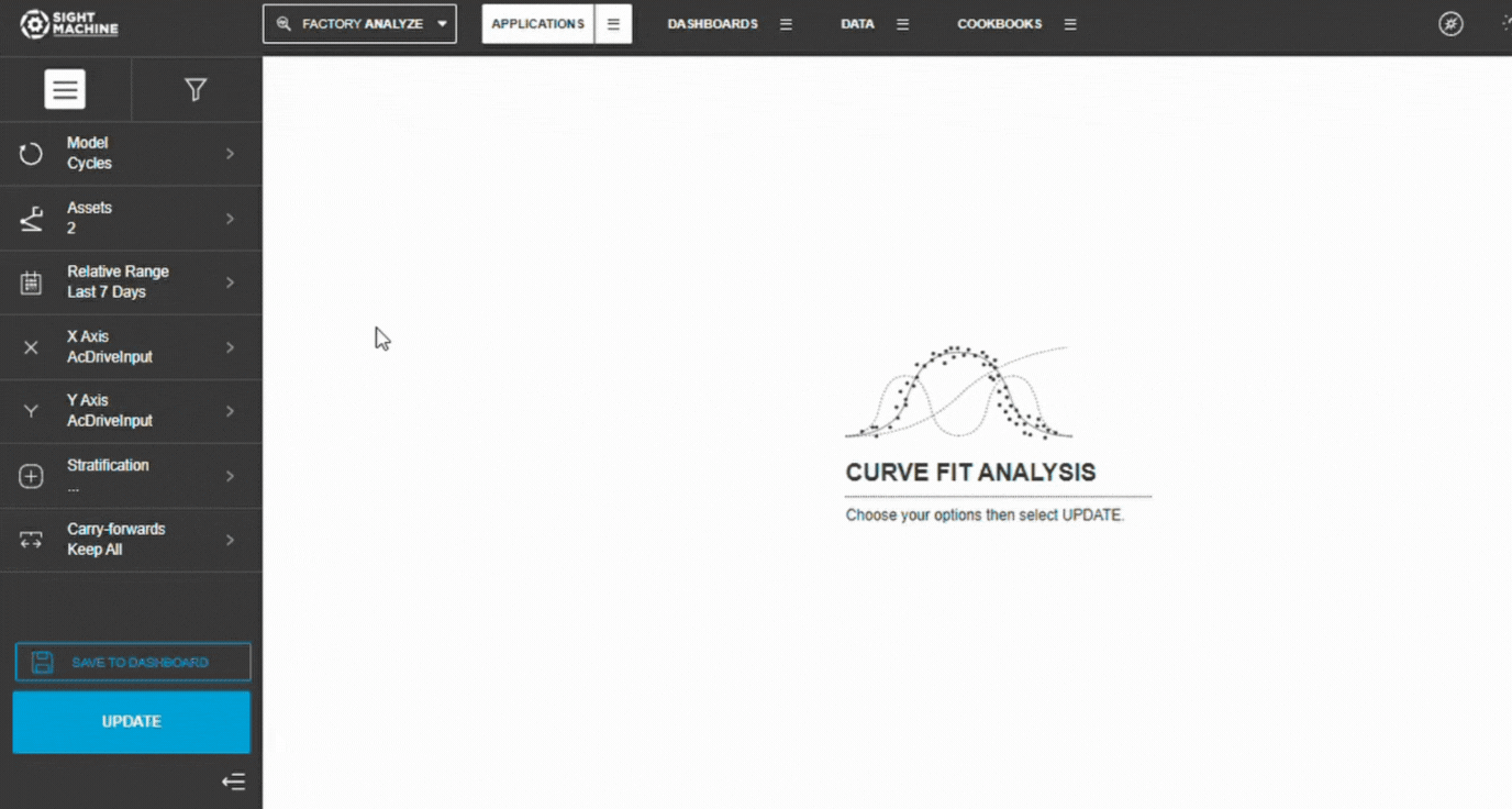
5. Select X and Y Parameters
Choose the X-axis parameter (independent variable).
Choose the Y-axis parameter (dependent variable).
Both must be numeric fields.
Example:
X: Oven Temperature
Y: Cure Time

6. Add Stratification (Optional)
To compare different conditions:
Select a categorical field (e.g., Shift, Product Type).
Each category generates its own regression line.
Leave blank for a single-line regression.

7. Configure Carry-Forwards
Choose how forward-filled values should be handled:
Keep All (default)
First
Last
8. Generate Results
Select Update.
Wait for the scatter plot and regression line to load.
Review statistical metrics and visuals
How Linear Regression Works
Least-Squares Method
Curve Fit Analysis uses linear least-squares regression, which fits the line that minimizes the squared distance between each data point and the regression line:
y = mx + b
m = slope
b = intercept
Calculation Formulas
Slope (m):
m = (n × Σ(xy) - Σx × Σy) / (n × Σ(x²) - (Σx)²)
Intercept (b):
b = (Σy - m × Σx) / n
Statistical Metrics Provided
1. Pearson-R
Measures linear correlation strength.
Range: –1.0 to +1.0
≥ 0.7 strong
0.4–0.7 moderate
< 0.4 weak
💡 Tip: Pearson-R only measures linear patterns.
2. R-squared (R²)
Explains how much of Y’s variance is predicted by X.
Range: 0.0–1.0
≥ 0.7 strong predictor
0.4–0.7 moderate
< 0.4 weak
Formula: R² = r²
3. P-value
Indicates statistical significance.
p < 0.05 → significant
p < 0.01 → highly significant
p ≥ 0.05 → not significant
⚠️ Warning: Significance ≠ causation.
4. Standard Error
Measures how far points deviate from the regression line.
Lower values = better fit.
Data Requirements
Numeric Fields Only
X and Y must be continuous numeric fields.
Categorical fields can only be used for stratification.
Cycles vs. Parts
Cycles → machine cycle data
Parts → part-level comparisons
Date Ranges: Use relative or absolute windows.
💡 Tip: Be cautious of long ranges that include process or equipment changes.
Interpreting Results
Scatter Plot: Shows:
Distribution of data points
Regression line alignment
Concentration or spread
Outliers
Histograms: Display data distributions for X and Y:
Identify skew
Spot outliers
Check data ranges
Common Use Cases
1. Predict Outcomes: Use regression equations to estimate results (e.g., predict Cycle Time from Temperature).
2. Identify Drivers: Understand how inputs relate to outputs.
3. Validate Expectations: Confirm whether expected relationships hold true.
4. Compare Conditions: Use stratification to test differences across shifts, operators, products, or machines.
Limitations & Considerations
Linearity Requirement: Relationships must be linear. Non-linear patterns require other methods.
Outliers: Large deviations can distort the regression line. Always inspect visually.
Causation: Regression describes correlation; it does not prove cause-and-effect.
Sample Size
Minimum: 30 points
Recommended: 100+
⚠️ Small datasets can produce misleading slopes or R².
Feature Benefits
Detailed Relationship Validation: Allows for in-depth investigation of the relationship between two specific parameters, confirming whether a high correlation value is meaningful or just a data artifact.
Linear Regression Computation: Computes and visualizes a linear least-squares regression between the two parameters, providing a precise, quantifiable fit line.
Comprehensive Scatterplot Visualization: Provides a clear visual representation via a scatterplot, complete with histograms along each axis to simultaneously show the individual distributions of the two parameters.
Stratification Capability: Allows users to select a categorical field for stratification, enabling the breakdown of data points into separate traces to analyze how the relationship differs across various categories (e.g., product type).
Validation Metrics (R-squared & Pearson-R): Delivers a table of key regression metrics, including the Pearson-R correlation coefficient and the R-squared value (see note below). The R-squared value provides a simple estimate of how well the independent variable determines the dependent variable (closer to 1.0 indicates a stronger fit).
NOTE: Statisticians can speak volumes on the finer points of interpreting the r-squared value, but it is basically an estimate of how well the independent variable (the variable on the X axis of your chart) determines the dependent variable (the variable on the Y axis of your chart). Small numbers close to zero indicate a weak relationship. Bigger numbers close to one indicate a stronger relationship.Strategic Exploratory Tool: Most helpful later in the exploratory process; serves as an excellent follow-up tool after identifying key pairs using the Correlation Heatmap or Time-Series Correlation.
Model Flexibility (Cycle & Part): Supports multivariate analysis on Cycle and Part data models, enabling high-granularity analysis within a machine (Cycle model) or cross-machine comparison (Part model).
Integrated Summary Statistics: Includes a table of summary statistics (Count, Standard Deviation, Min, Max) for both selected parameters, providing immediate contextual data for the analysis.
Summary
The Curve Fit tool outputs a scatterplot with a regression line and two histograms, one for each parameter. This enables you to gain a deeper understanding of the relationship between the two parameters.
For example, the stratification that you set applied a different color for the data points for each machine, allowing you to see if the machine impacted the relationship.
The value of correlation is represented by the Pearson-R correlation coefficient, and you can see other useful statistical metrics displayed, such as r-squared (see note below), p-value, and standard error.NOTE: Statisticians can speak volumes on the finer points of interpreting the r-squared value, but it is basically an estimate of how well the independent variable (the variable on the X axis of your chart) determines the dependent variable (the variable on the Y axis of your chart). Small numbers close to zero indicate a weak relationship. Bigger numbers close to one indicate a stronger relationship.