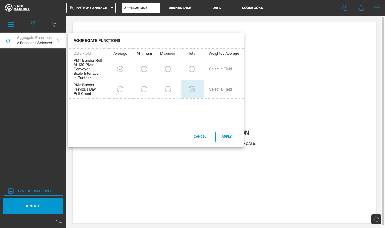
Aggregate Function
The Data Visualization application aggregates the Y axis variable(s) as an average per cycle, or minimum, maximum, or total of all cycles over the time range selected. You can select multiple aggregate functions for each data field, enabling you to see an average, minimum, maximum, and/or total for each variable.
By default, this aggregate function is set to 'average' for all selected data variables, but can be updated in the Advanced Filters interface.
Annotating data fields with default-aggregation
As process engineers, you are often monitoring process health and visualizing line losses, thereby visualizing a few key data fields on a regular basis. Data fields representing losses would often require a total aggregate function, whereas process variables such as equipment temperature or pressure would need to be aggregated as an average.
Data fields can be annotated in the pipeline using the default-aggregation annotation. Once the data fields aggregates are specified, the Data Visualization tool will automatically apply the aggregate function that is specified for a particular data field.