The Data Visualization tool supports several types of visualizations via the Chart Type selector. The chart types available include Line, Bar, Grouped Bar, Stacked Bar, Bar & Line, Pareto, Scatter, Heatmap and Box. These options enable you to visualize your data in unique ways, and gain insights into your data.
Options for Specific Chart Types
Certain chart types have additional options that enrich your visualizations.
Grouped Bar, Bar & Line
The Grouped Bar and Bar & Line chart types provide additional options that allow you to present the bars in Ascending, Descending, or Auto order, and also lets you limit the data shown by setting the Number of Bars to show All Bars, or only the Top N Bars.
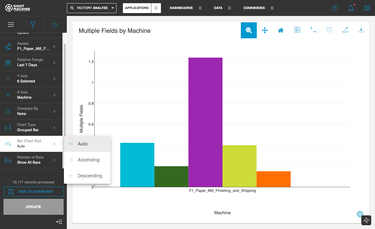
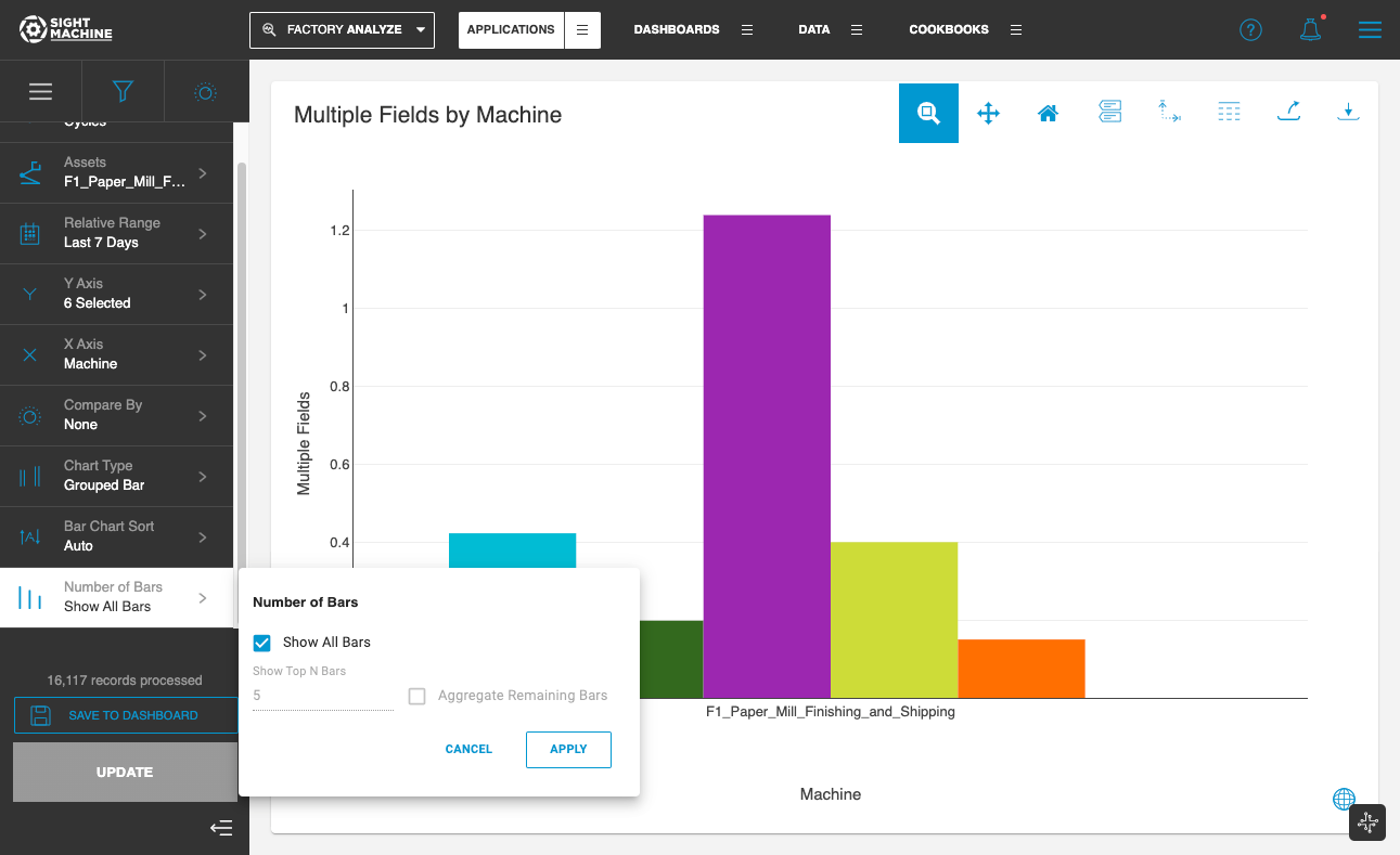
Please note that these options are enabled only when the X-axis has a categorical variable selected.
Scatter Plot
Scatter plots provide an additional option for Data Sampling. It is recommended that Data Sampling is set to On when there is a large amount of data, to enable optimized performance of the application when rendering a scatter plot with tens of thousands of data points.
