The Feature Importance Analysis application helps you understand the relationship between a dependent variable (y) and multiple independent variables (x). Unlike standard correlation-based analysis, Feature Importance provides more advanced insights, as it accounts for interactions between the independent variables (tags) and offers a deeper understanding of how different features contribute to the dependent variable.
This analysis can be performed either the linear model or the Random Forest model.
Use Cases
Feature Importance is designed for investigating the predictive power that a group of tags have with respect to a certain outcome.
Outcome: This is the final result you are interested in, such as Quality, Throughput, or Scrap Produced. It represents what you want to learn more about.
Predictors: These are the tags or variables that might influence the outcome. They can include machine set points, process parameters, ambient conditions, or other relevant factors.
This analytic uses either a linear model or a Random Forest (Machine Learning) model to investigate the relationships between the outcome and the tags. Using what it learns about the relationships, it produces a metric called “Feature Importance” which is a measure of how certain the model is that a given tag has predictive power with respect to the outcome. Please note that feature importance does not indicate size of the effect, but rather certainty that a relationship (or correlation) exists at all.
How to Use Feature Importance
Once the Feature Importance Analysis application loads, you can use the following sidebar options to run your analysis.
1. Select either the Cycles model or the Parts model for your source data. It is recommended that you choose the Parts model only if you know that it has been configured and that the outcome you are interested in is associated with each Part rather than with a unit of time. For example, if the outcome of interest is Quality, then you would likely want to use the Parts model since a quality score is reported for each part. If the outcome of interest is Downtime Duration or Defect Rate, then you would likely want to use the Cycles model.
2. Select the asset with which your desired outcome is associated.
3. Select an outcome on the Y-axis - for example, Quality, Throughput, or Scrap Produced.
4. On the X-axis, select tags that are potentially correlated with the outcome. It is recommended that you select between 5 and 30 tags for the X-axis, but you can always select more. Only the top 10 predictor tags will appear in the chart. It is important to note that X-axis tags that are null or constant during the selected time period are dropped from the results. The Diagnostics pane provides a list of these tags.
5. Select a range of dates to use. You can select as many days of data as you want, but the ideal range is 1-2 weeks. Data will be downsampled as needed in order to create a model in a reasonable amount of time. It is recommended that you select a smaller range of time if you are investigating a specific event or period of time.
6. Select your model type - Linear or Random Forest. Most use cases will require Random Forest because it considers interaction effects and non-linear relationships. Please choose the Linear model if you are reasonably certain that the tags and outcome involved have linear relationships with each other (i.e. when one increases by x amount, the other increases/decreases by y amount).
Interpreting Results
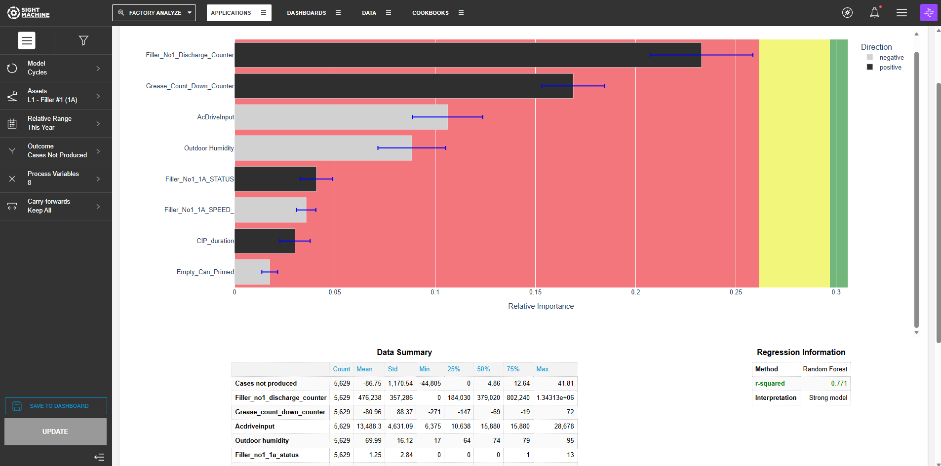
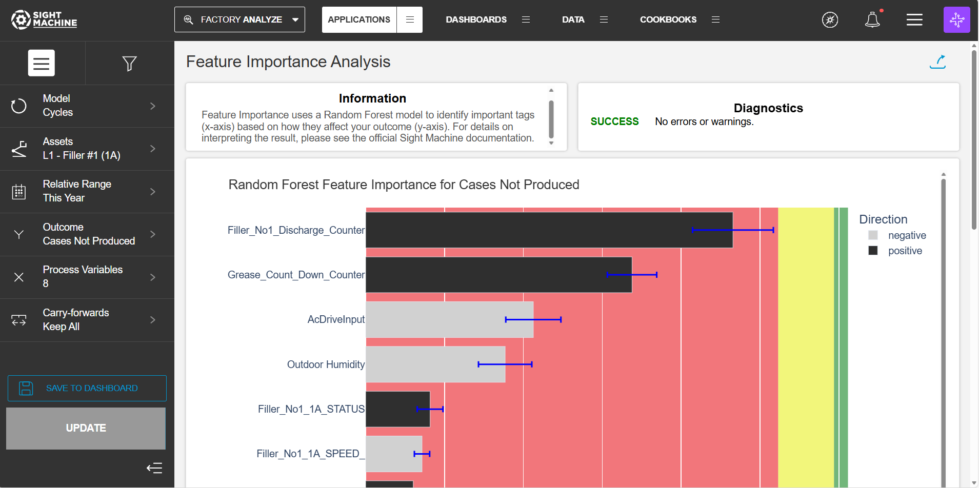
The Relative Importance scores shown in the chart are a measure of how important the tag is for predicting the outcome. “Relative Importance” means that the scores have meaning with respect to each other, but cannot be compared to the importance scores from a different model.
The green, yellow, and red zones indicate what’s actually “important”, or highly related to the outcome, as compared to random noise.
- Any tags falling in the green zone are definitely important in some way, meaning they are more useful for predicting the outcome than a random number.
- The yellow zone indicates that the tag may be important.
- Red indicates that the tag is likely not important - that is, it is not more useful than a random number when it comes to predicting what the outcome will be.
The Direction of Effect answers the question “If we fit a trend line to this tag and the outcome, would the slope be positive or negative?” For example, if the Direction of Effect is positive for tag1, then that means that if all other tags are held constant but tag1 increases, we’d expect the outcome to increase. A “neutral” direction of effect means that the tag is only important when interactions with other tags are considered.