Overview
Build Visualization uses a grid layout structure that can contain multiple panels. Each panel can be a type of visualization such as chart or table.
The final response from Page Logic is a JSON that contains panels and grid_layout_props properties:
# === Structure the output response ===
response = {
"panels": [chart_panel, main_table_panel],
"grid_layout_props": grid_layout_props
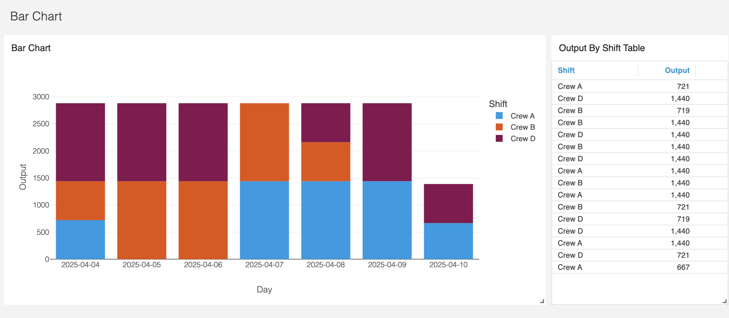
}The above creates this:
Panels
Panels are created in the Page Logic. Each panel is a dictionary with the following high-level keys:
Key | Type | Required | Description |
|---|---|---|---|
| string | Yes | Unique identifier for the panel. |
| string | Yes | Type of visualization (e.g., |
| object | Yes | Properties specific to the visualization type. |
| object | No | Configuration for the panel title. |
The title object contains the following keys:
Key | Type | Required | Description |
|---|---|---|---|
| string | Yes | The text to display as the title. |
| number | No | Font size of the title text. (e.g. 16) |
| string | No | Alignment of the title (e.g., |
| string | No | CSS margin for the title. |
Below is an example of a plotly chart panel:
chart_panel = {
    "id": "plotly-chart",
    "viz_type": "plotly",
    "viz_props": fig_json,
    "title": {
        "value": "Bar Chart",
        "font-size": 16,
        "align": "left",
        "margin": "13px 13px 13px 13px",
    },
}
Plotly viz_props
fig_json here is the JSON output from the Plotly chart. See Chart for more information.
and here is an example of a mui datagrid table:
main_table_panel = {
    "id": "main-table",
    "viz_type": "mui-datagrid",
    "viz_props": table_props,
    "title": {
        "value": "Output By Shift Table",
        "font-size": 16,
        "align": "left",
        "margin": "13px 13px 13px 13px"
    },
}
Datagrid viz_props
table_props here is the configuration for the table. See Datagrid for more information.
Grid Layout
Once the panels are created, we need to specify the layout of the page. We use react-grid-layout as the layout framework. Here is an example of a layout with two panels.
grid_layout_props = {
    "layout":[{
        "w": 9,
        "h": 12,
        "x": 0,
        "y": 0,
        "i": "plotly-chart",
        "static": "true"
    },
    {
        "w": 3,
        "h": 12,
        "x": 9,
        "y": 0,
        "i": "main-table",
        "static": "true"
    }
]}
The grid works on a 12 column layout. The "i" corresponds to the "id" of the panels. The "w" is the width of the panel and the "x" is the x axis starting point of the panel. So in the example above, the plotly-chart starts at "x": 0 column and has a "w": 9 columns. The main-table starts at "x": 9 and spans "w": 3 columns.
Here are the available attributes for each panel item in the layout:
{
  // A string corresponding to the component key
  i: string,

  // These are all in grid units, not pixels
  x: number,
  y: number,
  w: number,
  h: number,
  minW: ?number = 0,
  maxW: ?number = Infinity,
  minH: ?number = 0,
  maxH: ?number = Infinity,

  // If true, equal to `isDraggable: false, isResizable: false`.
  static: ?boolean = false,
  // If false, will not be draggable. Overrides `static`.
  isDraggable: ?boolean = true,
  // If false, will not be resizable. Overrides `static`.
  isResizable: ?boolean = true,
  // By default, a handle is only shown on the bottom-right (southeast) corner.
  // As of RGL >= 1.4.0, resizing on any corner works just fine!
  resizeHandles?: ?Array<'s' | 'w' | 'e' | 'n' | 'sw' | 'nw' | 'se' | 'ne'> = ['se']
  // If true and draggable, item will be moved only within grid.
  isBounded: ?boolean = false
}
Preview Tools
You can drag and resize the panels in preview mode and copy the layout back to Page Logic to finalize the output See the Grid Layout Preview Tool for more info.
Bringing it Together
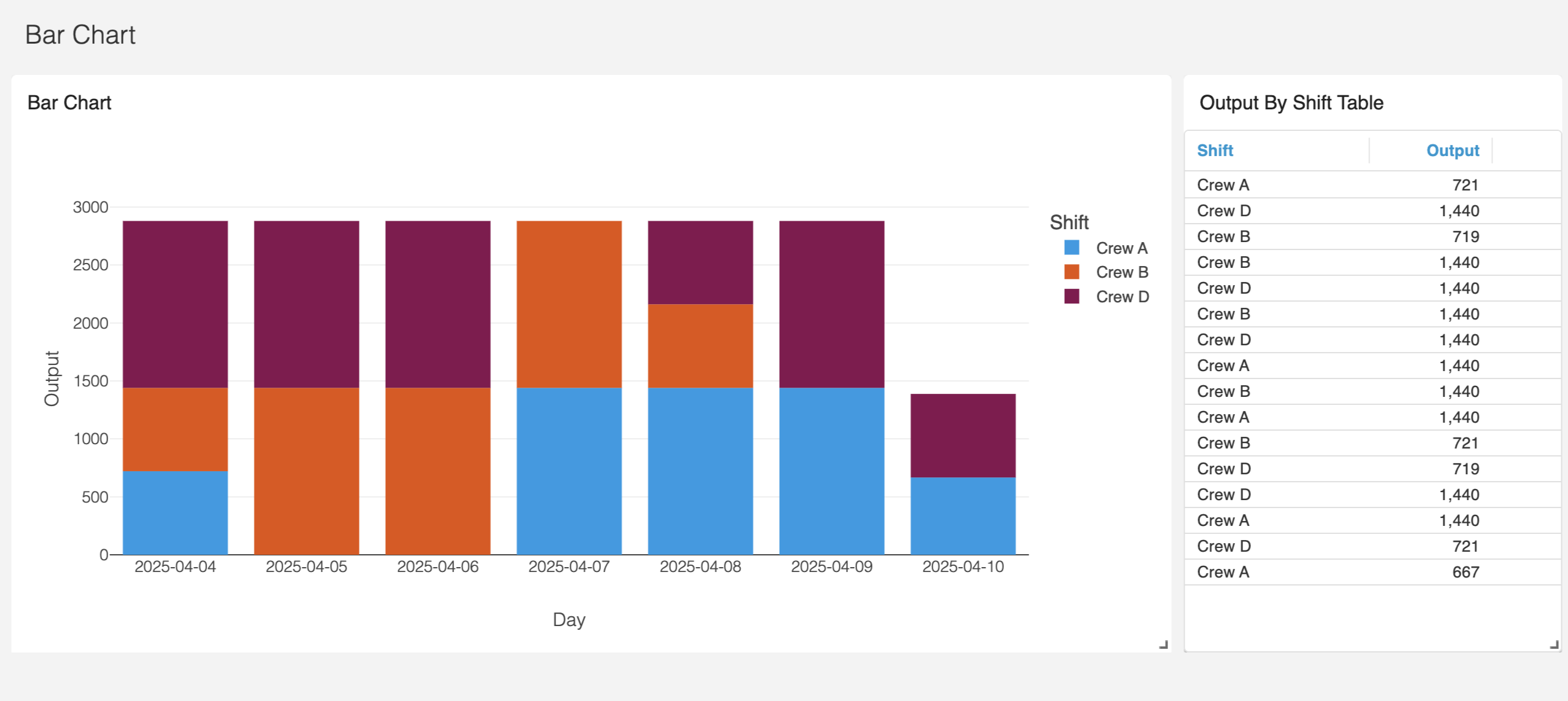
Again, when we combine the items above to the final output response:
# === Structure the output response ===
response = {
    "panels": [chart_panel, main_table_panel],
    "grid_layout_props": grid_layout_props
}
we create this: