OEE Visibility
- Print
- DarkLight
OEE Visibility
- Print
- DarkLight
Article summary
Did you find this summary helpful?
Thank you for your feedback
Use Cases
The OEE Visibility tool allows you to visualize key performance indicators (KPIs), including OEE, the components of OEE (Availability, Performance, and Quality), and other models, such as Downtimes and Defects. These KPIs are built from machine-level and system-level data, and are calculated in a consistent manner for all facilities feeding data into the Sight Machine platform. This gives your organization a standardized method for comparing performance and other KPIs across your machines, lines, and facilities.
Specifications
The OEE Visibility tool is designed to quickly build charts and visualizations of OEE and its components and related KPIs. It can help you identify trends in OEE, compare OEE across machines, shifts, and factory locations, and pareto the top causes of downtimes and defects.
How to Use OEE Visibility
The OEE Visibility tool allows you to visualize key performance indicators.
To use OEE Visibility:
- On the Analysis tab, under Data Exploration, click OEE Visibility.
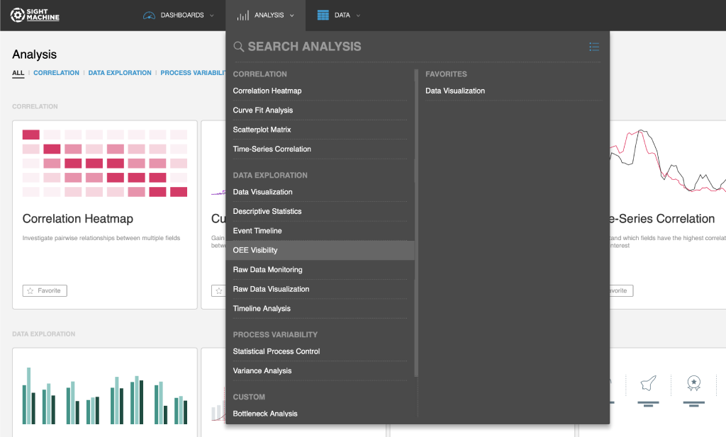
- Alternatively, you can do the following:
- On the Analysis tab, click the All Analyses button.
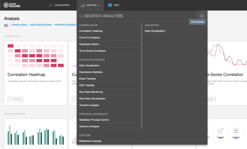
- On the Analysis landing page, on the Data Exploration page, click OEE Visibility.
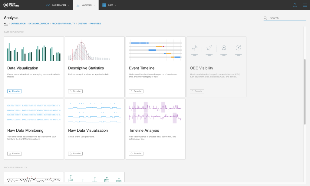
- On the Analysis tab, click the All Analyses button.
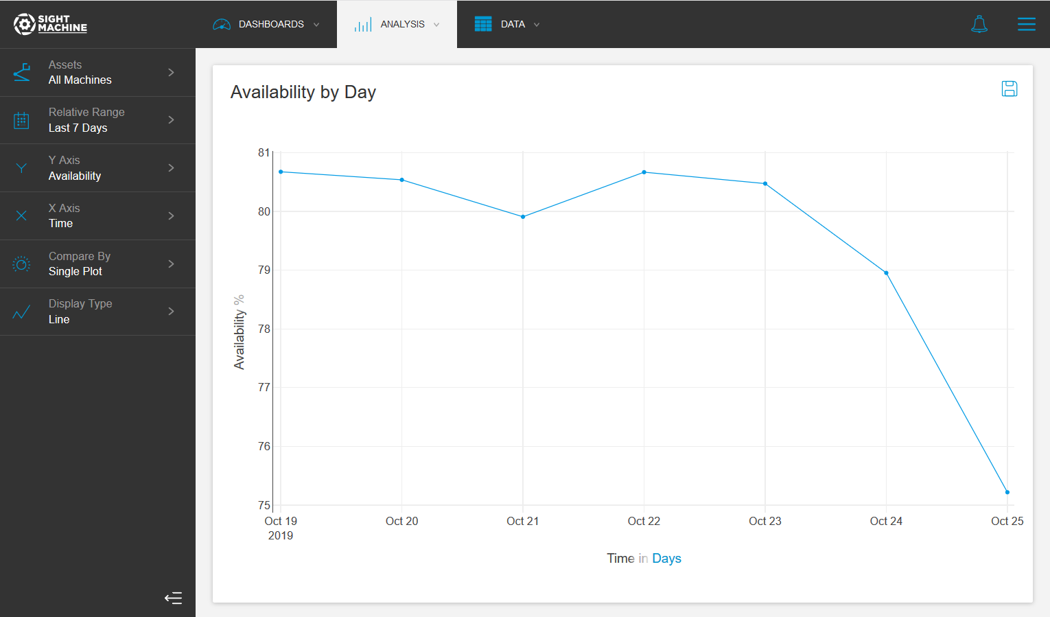
- On the main OEE Visibility screen, select your options on the left. For more details about each option, see OEE Visibility Options.
- There is no Update button for OEE Visibility. Any time that you change a selection, the chart updates automatically. In the examples below, the charts refresh automatically after the Relative Range is changed.
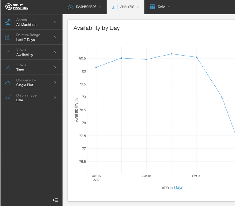
OEE Visibility Options
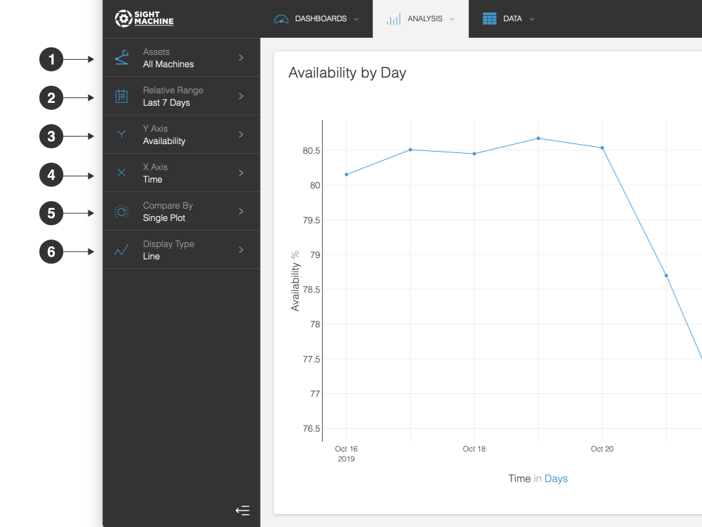
The OEE Visibility options include:
- Assets: You can select which assets you want to view, sorting by asset type or location.
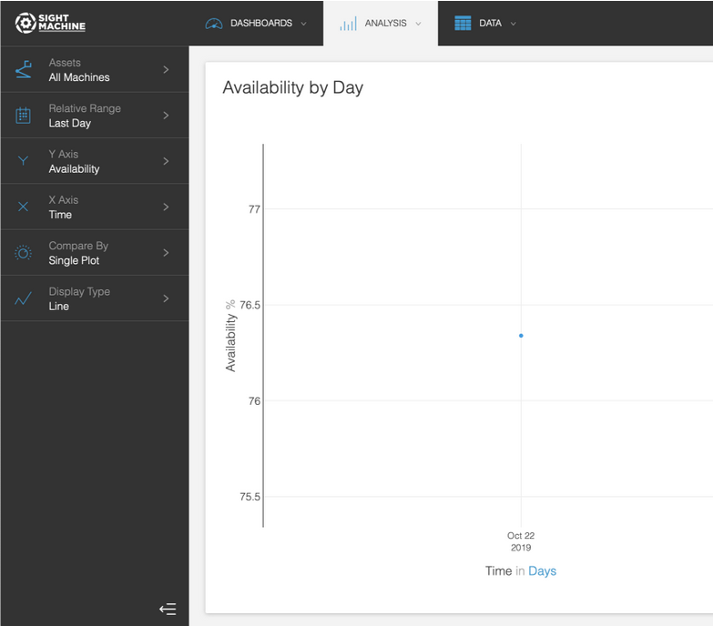
- Relative Range: You can define a date range of data points to analyze for the assets you have selected. For example, select the last 7 days. This option establishes the boundaries for the near real-time data that will be part of your analysis. Select from relative or absolute timeframes.NOTE: You can only select dates, not times, as KPIs are calculated on a per-Shift basis.
- Y Axis: You can select the KPI that you want to display on the Y axis.
- X Axis: You can set the X axis on your chart. The available options will depend on your Y axis selection.
- Compare By: You can compare the data by asset, asset type, or factory.
- Display Type: You can display the data as a bar, line, pie, pareto, or number display.
After you make your changes, the chart updates automatically. There is no Update button.
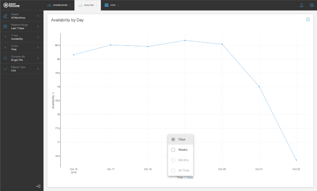
If you select Time on the X axis, after the chart loads, you see Time in Days at the bottom of the chart area. You can then click Days and adjust the time interval of the chart.