Raw Data Visualization
- Print
- DarkLight
Raw Data Visualization
- Print
- DarkLight
Article summary
Did you find this summary helpful?
Thank you for your feedback
Generating a Raw Data Visualization
You can generate time series and distribution charts for your raw data.
To generate a Raw Data Visualization:
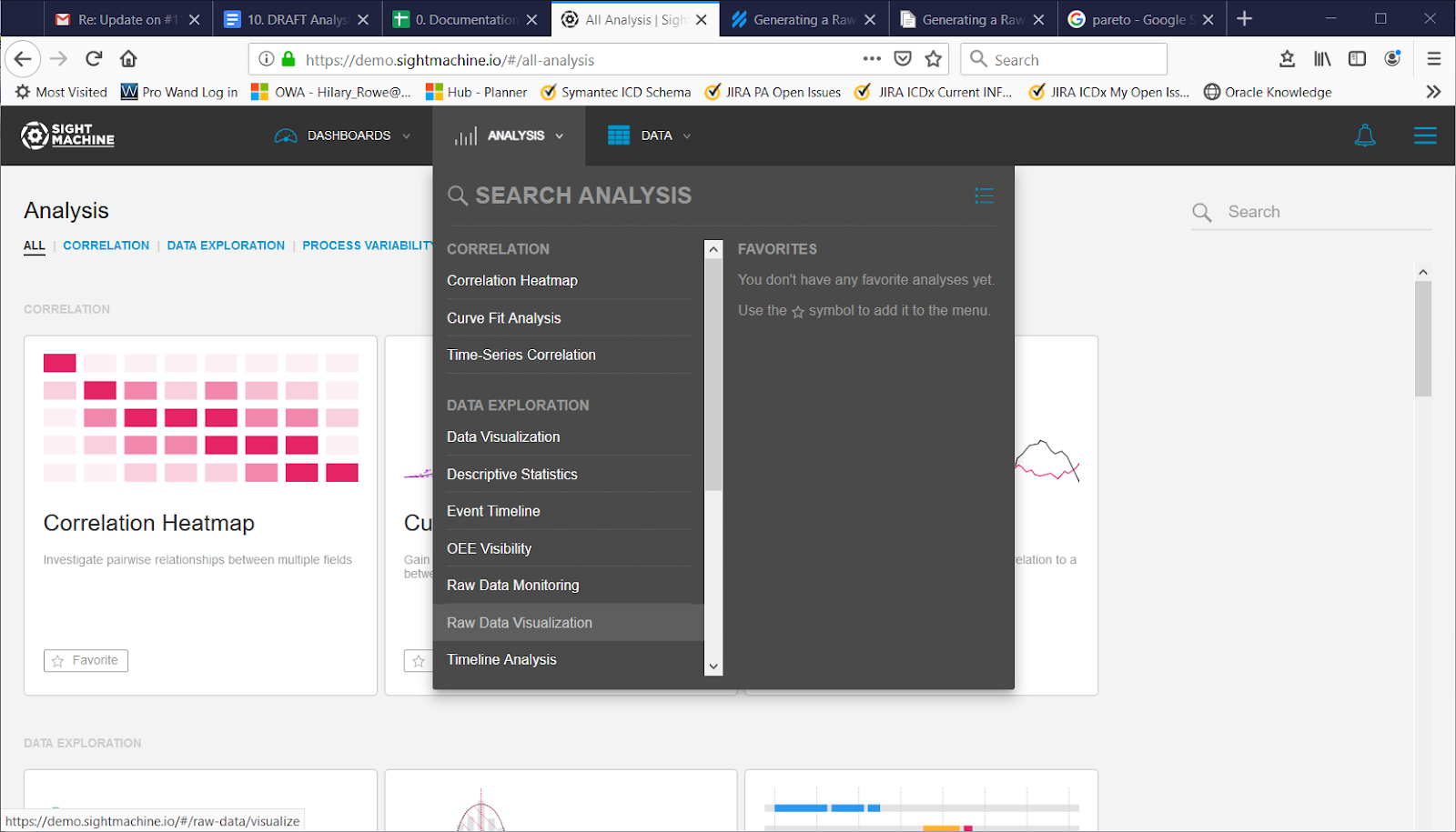
- On the Analysis tab, under Data Exploration, click Raw Data Visualization.
- On the main Raw Data Visualization screen, select your options on the left. For more details about each option, see Raw Data Visualization Options.
- Click Update.
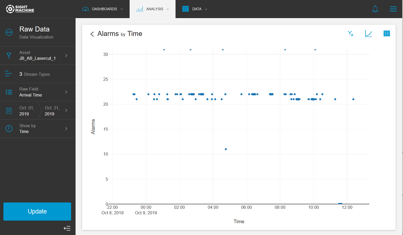
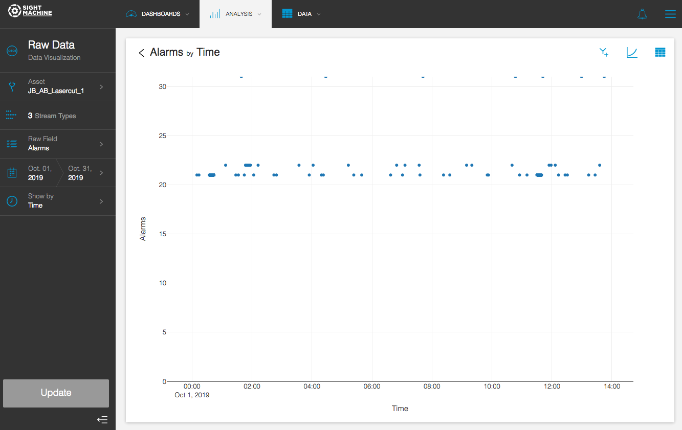
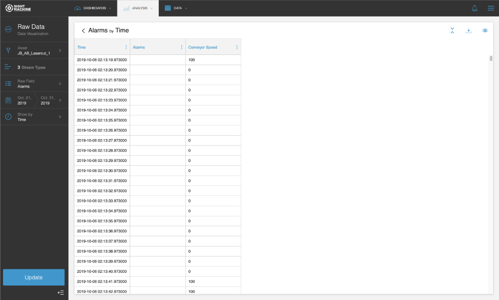
- View the results. This example shows a scatterplot of alarms by time.
Raw Data Visualization Options
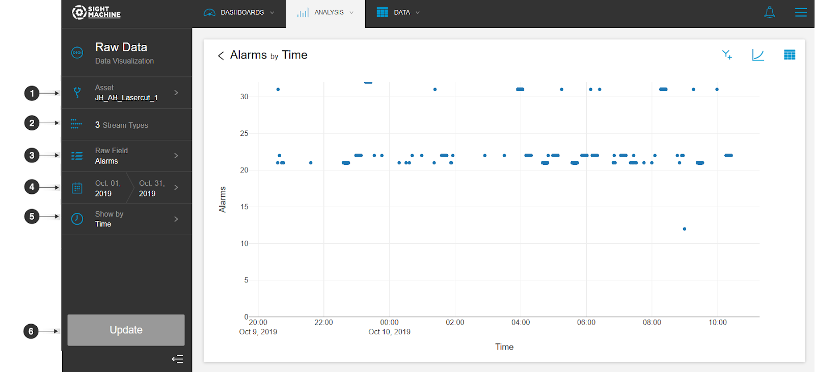
The Raw Data Visualization options include:
- Asset: You can select an asset from your raw data.
- Stream Types: You can select one or more stream types. All are selected by default, and you can remove stream types to apply a filter.
- Raw Field: You can select one raw field to visualize over time.
NOTE: You can later select a second field, but are limited to one in this window. - Date Range: You can click the date range selector, and then select the range that you want to display.
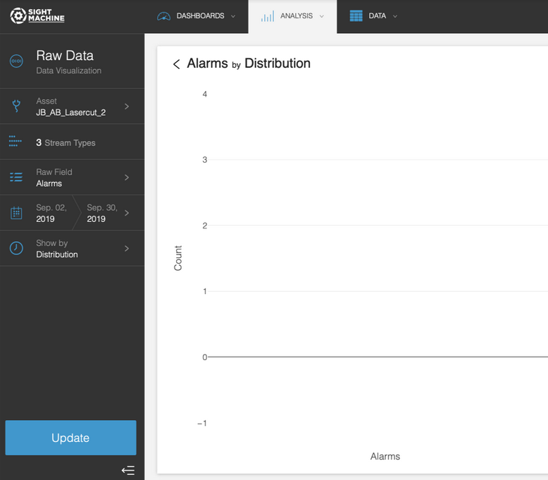
- Show by: You can change the chart from time series to distribution (that is, how often the variable you selected occurs at certain values).
- Update: Click this button to generate the chart.
NOTE: If the results contain more than 10,000 records, the interface only displays the first 10,000.
Customizing the Raw Data Visualization
After you visualize your raw data, you can make customizations to it using the toolbar.
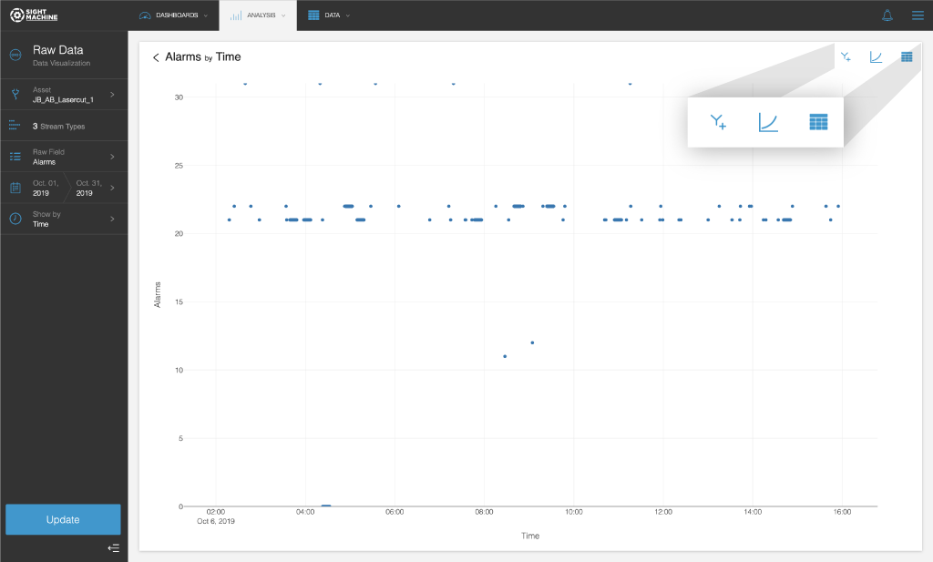
To customize the Raw Data Visualization:
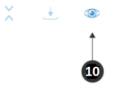
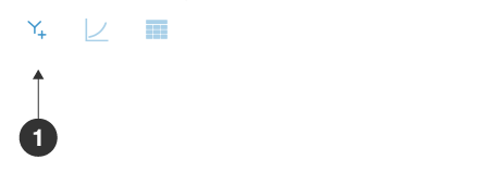
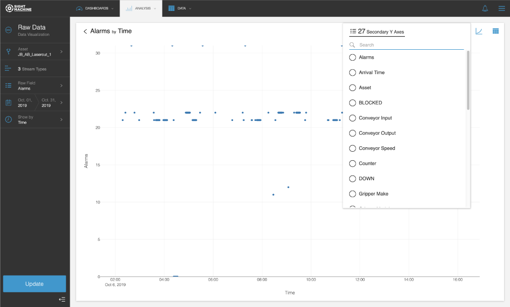
- On the Raw Data Visualization screen, you can show a secondary Y axis on the chart. In the toolbar in the upper-right, click the Y+ button.
- In the Secondary Y axis window, make a field selection.
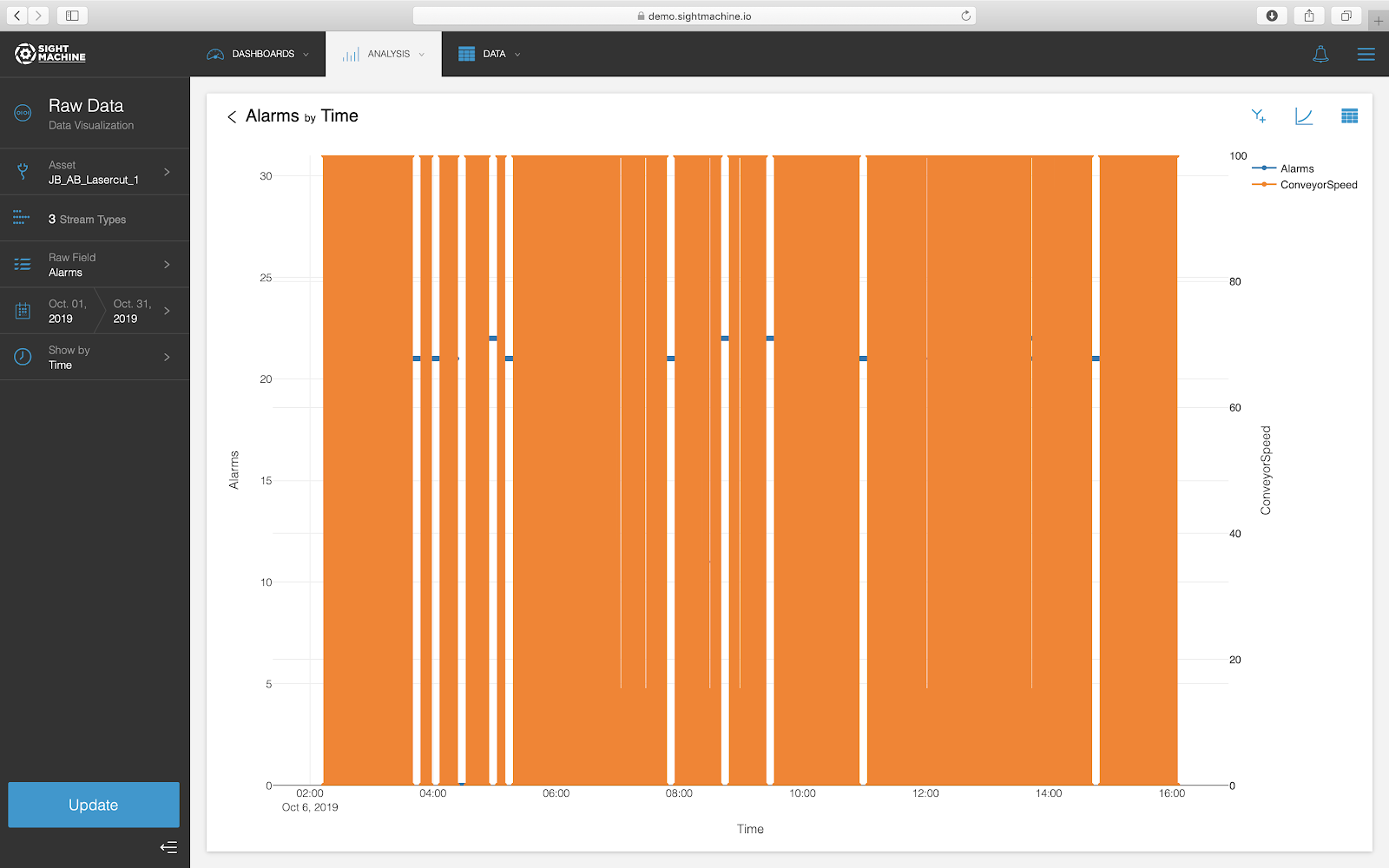
- Click Update. The chart now displays two color-coded fields.
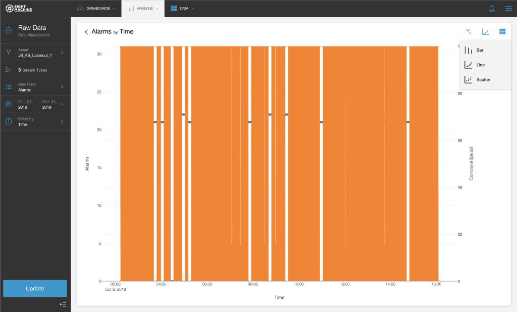
- To change the type of chart, in the toolbar, click the chart type button.
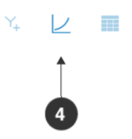
- Select one of the following options:
- Bar
- Line
- Scatter
- To view the chart as an exportable table, in the toolbar, click the table viewbutton.
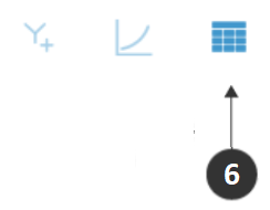
- View your raw data as a table instead.
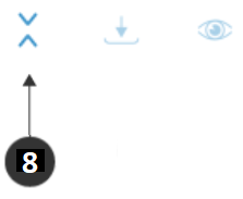
- In the table view, in the toolbar in the upper-right, click the double arrow button to toggle null rows.
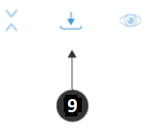
- In the toolbar, click the export button to download the table as a CSV file.
- In the toolbar, click the chart view button to return to the chart.