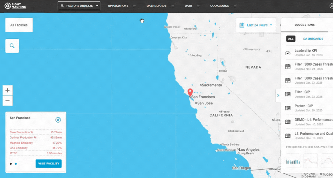
Overview
Data Visualization is a generalized charting application that provides a simple point-and-click interface to visualize contextualized data in a variety of ways. It is an excellent starting point for any data exploration activity, enabling users to analyze the trend of a variable over time, the distribution of values, or the comparison between two variables. This tool democratizes sophisticated data querying and analysis across the organization.
Specifications
Data Visualization is designed as a generalized charting application and is a great place to start for any data exploration. In general, there are four primary types of charts you can build:
Timeseries: Visualizes a variable's trend over time, supporting the display of multiple variables, a secondary Y-Axis, and comparison views.
Categorical Histogram: Displays the distribution of values for a categorical field, showing counts or aggregated metrics per category.
Continuous Histogram: Displays the frequency distribution of a numeric variable, illustrating data density and shape.
Box and Scatterplots: Compares the relationship or distribution between two variables, offering scatterplot (for relationships) and box plot (for distributions) options.
In addition, the tool allows you to:
Modify axis limits.
Add line limits.
Configure trace appearance.
Before You Begin
Ensure you have:
Access to the Analysis tab.
Contextualized data available for exploration.
A clear objective for the type of visualization you wish to create (e.g., trend, distribution, comparison).
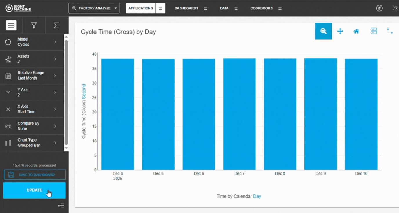
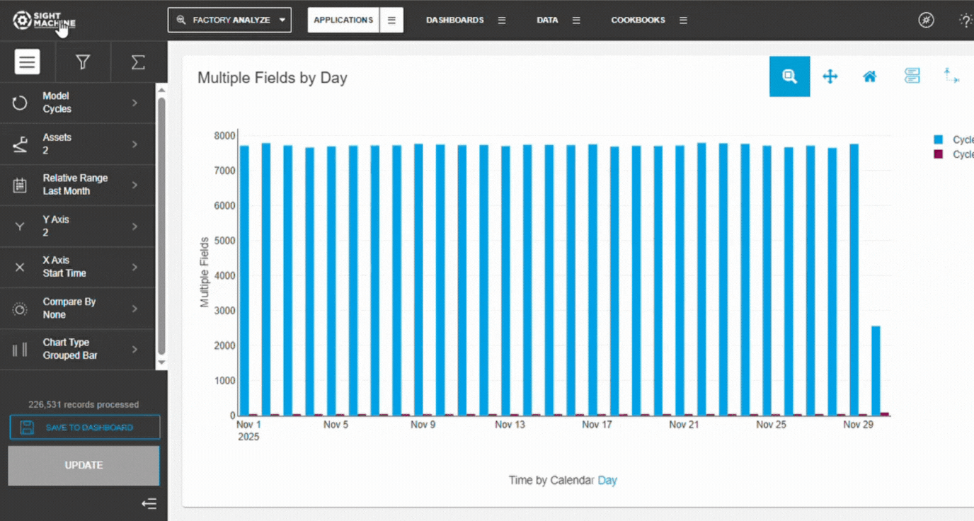
Create a Data Visualizations
1. Open Data Visualization
Navigate to the Analysis tab.
Under Data Exploration, select Data Visualization.
Alternatively: Click All Analyses on the Analysis tab, and select Data Visualization from the Data Exploration section.
2. Configure Visualization Options
On the main Data Visualization screen, select your desired options in the left configuration panel, including:
Selecting the primary chart type (Timeseries, Histogram, etc.).
Selecting variables for the X and Y axes.
Choosing aggregation methods for the Y-axis variable (Average, Min, Max, Total per cycle) if applicable.
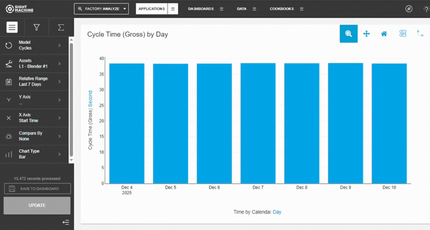
3. Generate and View Results
Click Update to generate the chart based on your selections.
View the resulting visualization.
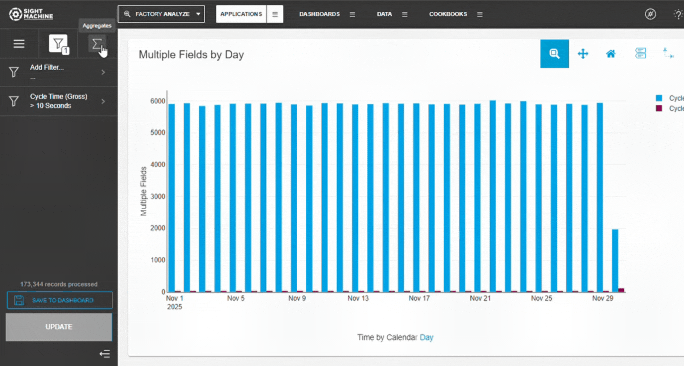
Filtering the Contextualized Data Visualization Results
The Custom Filters and Advanced Filters tabs on the Data Visualization screen sidebar allow you to further refine and aggregate the results displayed on your chart.
To Filter the Contextualized Data Visualization Results:
1. Access the Filtering Tabs and Apply Custom Filters
On the Data Visualization screen sidebar, access the Custom Filters or Advanced Filters tab. Click Add Filter, select a data field, and define your condition: choose specific values for Categorical Fields (toggling 'equal to'/'not equal to') or apply numeric conditions for Continuous Fields (e.g., range, greater than). Finish by clicking Apply.
2. Applying Advanced Filters and Updating Visualization
- On the Data Visualization screen sidebar, click the Advanced Filters tab. Select an aggregation for the Y-axis variable (e.g., average per cycle, minimum, maximum, or total of all cycles).
Note: This option is hidden if no aggregation is applied (such as with a scatterplot).
- After making your selection, click Apply and then click Update to refresh the chart with the new filtering and aggregation settings.
Selecting How to Visualize the Contextualized Data
The Data Visualization screen sidebar contains three tabs:
- Standard Filters: This tab contains all of the standard menus for generating a chart.
- Custom Filters: This tab contains filters that you can apply to the resulting data.
- Advanced Filters: This tab contains additional advanced options for selecting and visualizing data.
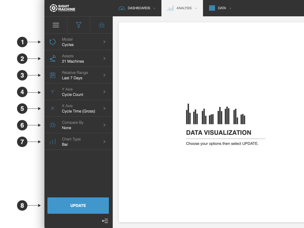
The standard filter Data Visualization options include:
- Model: You can select from among the contextualized data models. The models used for any implementation of Sight Machine vary based on the organization’s process and the goals, but the most common include Cycles, Downtimes, OEE, and Parts.
- Assets: You can select specific machines, sorting by machine type or location. On the Cycles, Downtimes, and Defects models, you can only select machines of the same type. On the OEE model, you can select machines across different types.
NOTE: When the Parts/Lots model is selected, the Asset selector is replaced by a Part Type/Lot Type selector. - Relative Range: Unlike traditional reporting tools, the Sight Machine platform is constantly pulling in real-time data. Last 7 Days is selected by default.
- Y Axis: You can set the Y axis on your chart. The options are dependent on the model and asset(s) that you selected. For example, the Cycles model includes some defaults (such as cycle count, cycle time, shift) as well all continuous data fields from the selected machine type.
- X Axis: You can set the X axis on your chart. The options are dependent on the model and asset(s) that you selected. For example, the Cycles model includes some defaults (such as time, cycle time, shift) and all of the continuous and categorical data fields from the selected machine type.
- Compare By: You can select what you want to compare, including machine type, raw field name, stream, unit, etc.
- Chart Type: You can display the data as a bar, line, bar + line, scatterplot, heatmap, pareto, or box.
- Update: Click this button to generate your data visualization chart.
Customizing the Contextualized Data Visualization
After you visualize your contextualized data, you can make customizations to it using the toolbar.
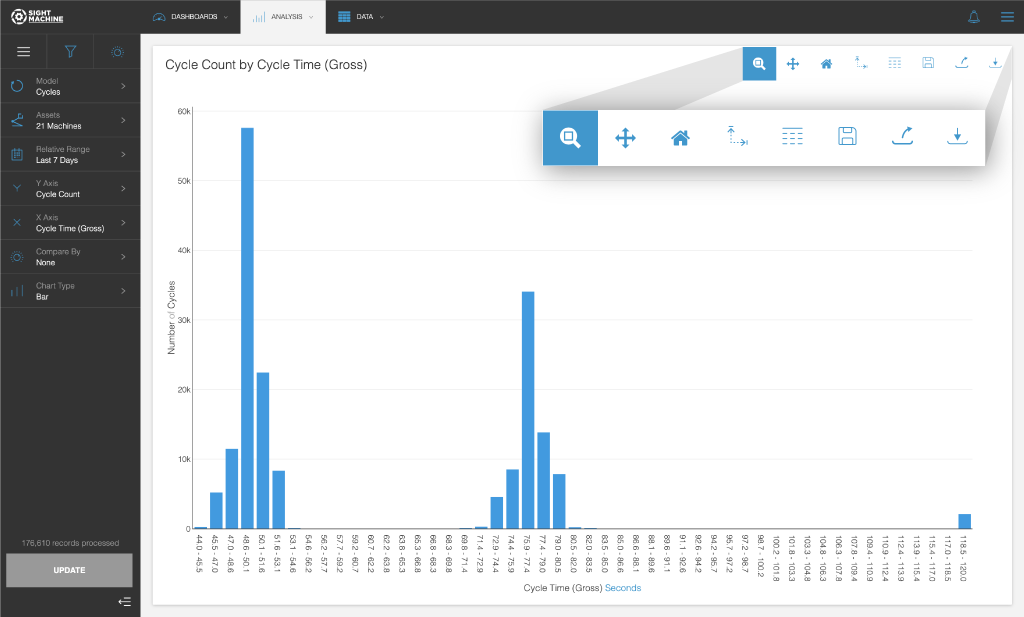
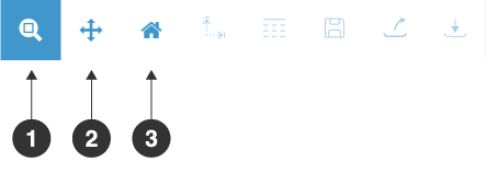
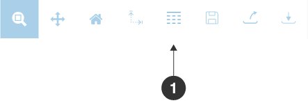
To change the view of the current chart:
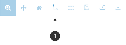
- Click the Zoom button on the toolbar to zoom in on any data.
- Click the Pan button to pan around in the data.
- Click the Reset Axes button to reset the chart to its default axes.
- Select or drag and move around the current chart to make changes.
To reconfigure the chart:
- Click the Chart Config button to reconfigure the chart.
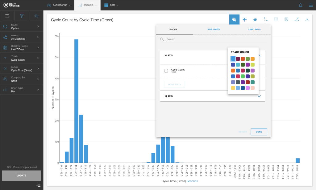
- Depending on the type of chart (line, bar, or scatter), you can set the color, type, and size of each trace within your chart. Click the Traces tab, and then make your changes.
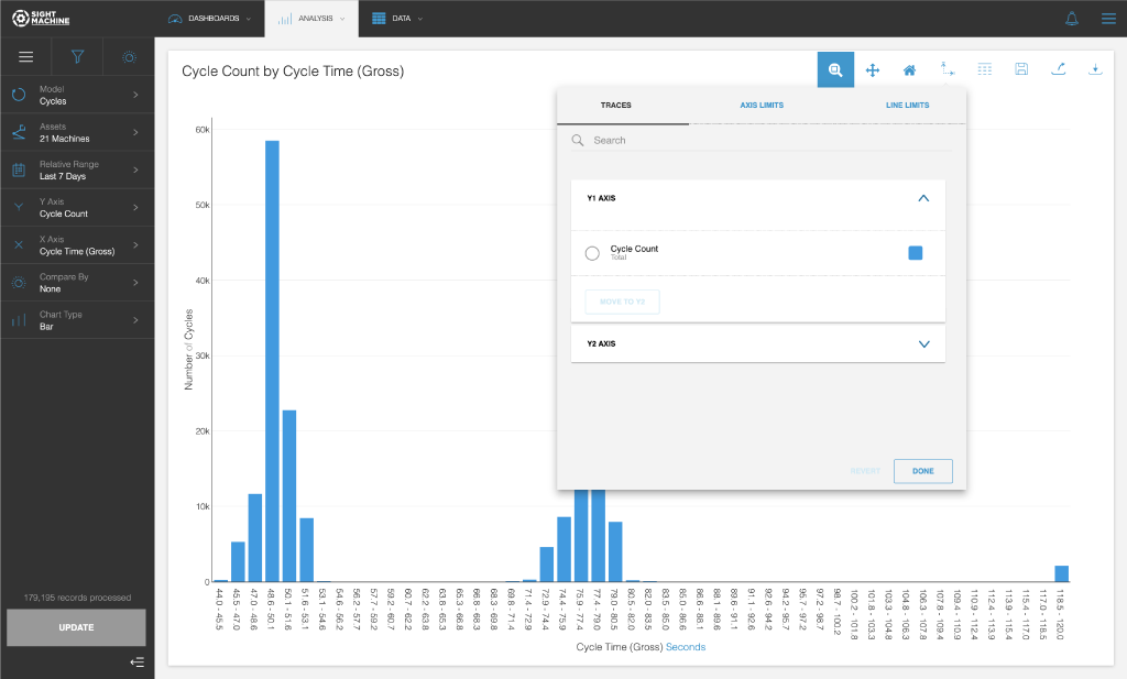
- Click the colored square icon to adjust the color palette for more distinguishable visualizations. The color you see is the current color of the chart.
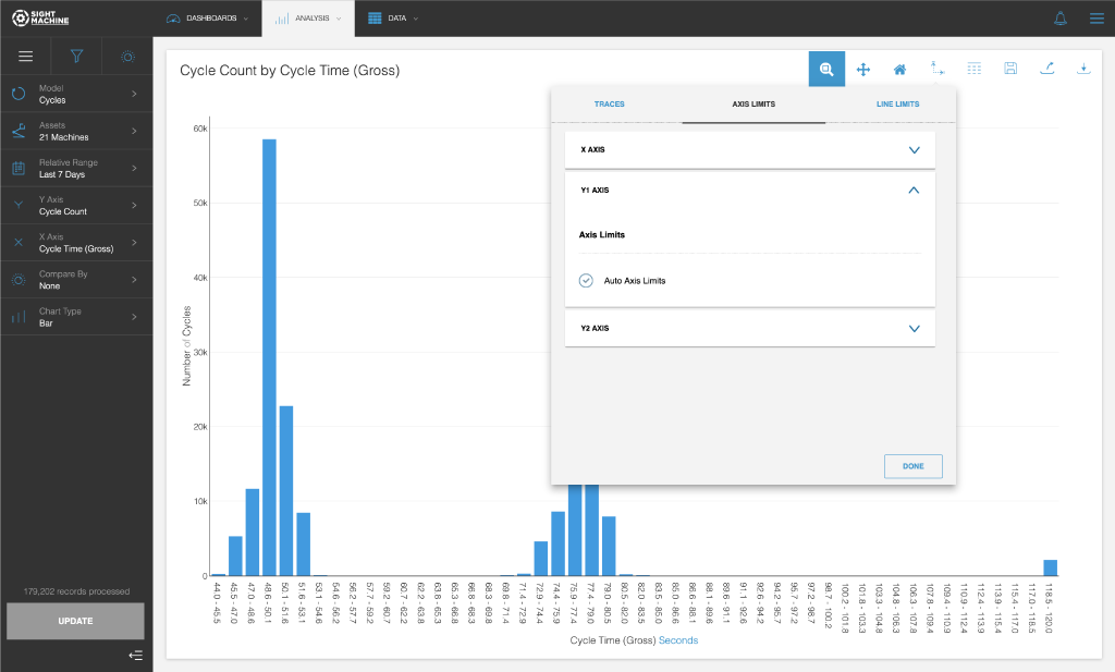
- Click the Axis Limits tab to reset limits to the X axis and Y axes.
- Click the Line Limits tab, and then click the Add New Line Limit to set a label and value.
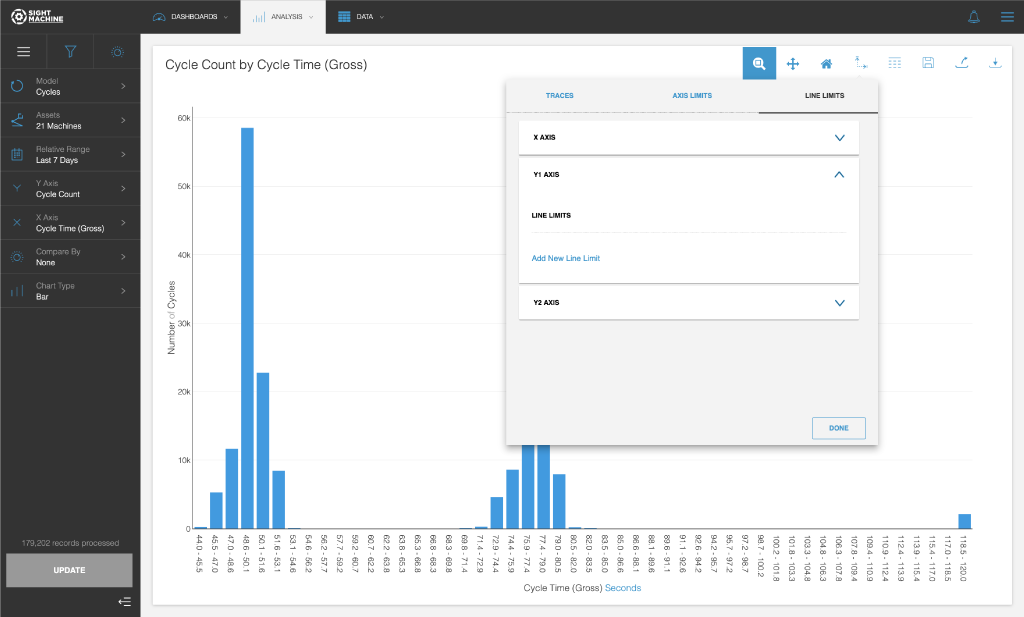
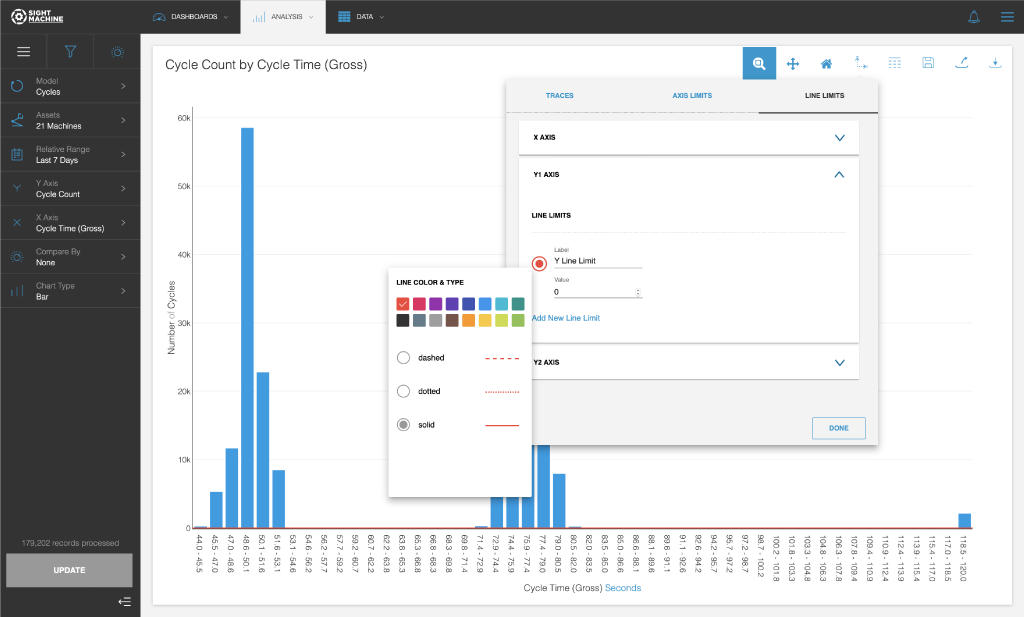
- Click Done after making your changes.
To display the data as an exportable table:
- Click the Table View button.
- To toggle back, click the Chart View button.
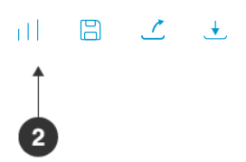
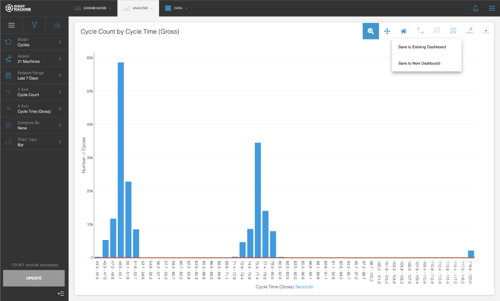
To save and share the Data Visualization:
- To save, click the Save button, and then select one of the following options:
- Save to Existing Dashboard: Search for an existing dashboard.
- Save to New Dashboard: Provide names for the new dashboard and the new widget on the dashboard.
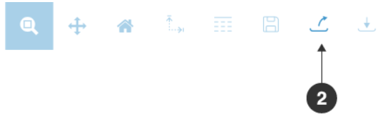
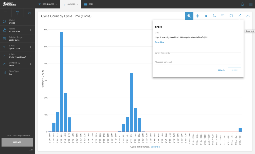
- To share this visualization with others, click the Share Link button.
- Make your selections, and then click Share.
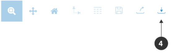
- To download the results as a CSV file, click the Download Data button.
Feature Benefits
Robust Data Filtering and Aggregation: Provides granular control over the data scope using Custom Filters (applying conditions to categorical and continuous fields) and Advanced Filters (controlling Y-axis aggregation, such as average, min, max, or total).
Dynamic Chart Interaction: Enables detailed data inspection through the use of Interactive Controls like Zoom, Pan, and Reset Axes, allowing users to efficiently navigate and restore the chart view.
Comprehensive Aesthetic Customization: Allows users to fully control the look of the chart via Chart Configuration, including setting trace color, type, and size, and applying Data Label Formatting (e.g., thousands separators for bar charts) for clarity.
Quantitative Limit Management: Provides the ability to manage analysis boundaries by configuring Axis Limits (min/max) and adding Line Limits (thresholds) to benchmark parameter performance against set criteria.
Seamless Output and Collaboration: Facilitates organizational workflow by supporting the saving of visualizations to Dashboards, generating Share Links for easy collaboration, and enabling the export of raw data via Table View and Data Download (CSV).
Summary
The Data Visualization tool enables you to quickly generate various chart types (Timeseries, Histograms, Scatterplots) to explore contextualized data. The application offers extensive customization through filters, aggregation settings, and chart configuration controls (like trace appearance and axis limits). The ability to save to a dashboard, share, and export the underlying data makes it a powerful and flexible starting point for data-driven exploration.