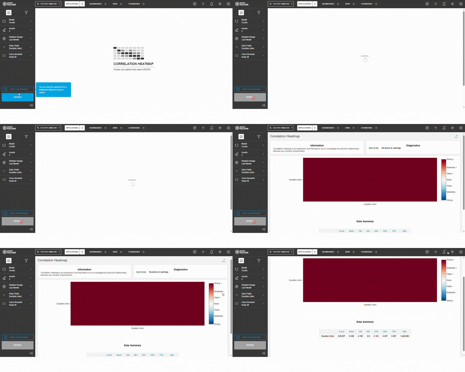
Overview
The Correlation Heatmap is a multivariate analysis tool that helps identify unexpected correlations among parameters, identifying root causes and affecting output fields. It can be used on Cycle and Part models for high-granularity and lower-granularity comparisons, making it a valuable first step in data analysis.
Before You Begin
Ensure you have:
- Access to the Application tab in Sight Machine
- Permission to view selected assets or part types
- At least 3–4 numeric parameters for correlation
- Minimum 30 observations in your selected date range
📝 Note: The more complete your dataset, the more reliable the correlations.
How to Create a Correlation Heatmap
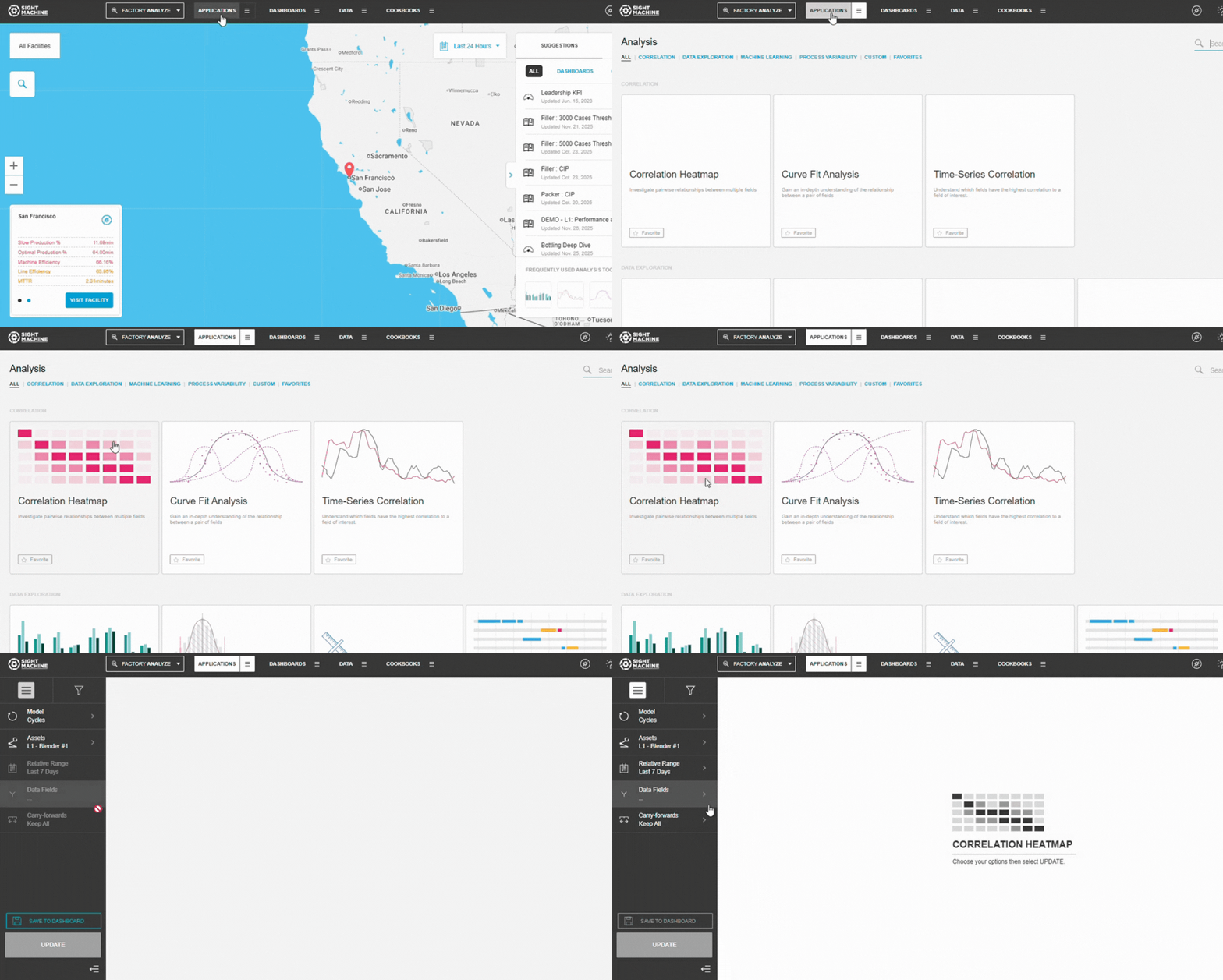
1. Open the Correlation Heatmap
- Navigate to Application
- Select Correlation
- Select Correlation Heatmap
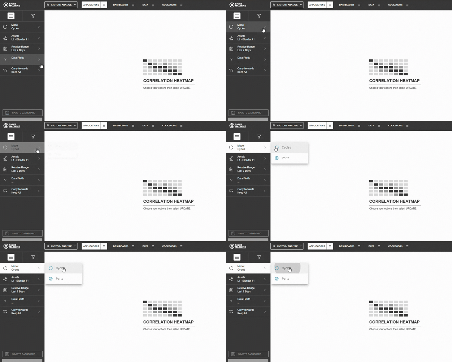
2. Select Your Data Model
Choose between:
- Cycles – analyze process parameters within the same asset or asset type
- Parts – analyze part-level characteristics across multiple machines
💡 Tip:
- Use Cycles when comparing readings from similar or identical machines.
- Use Parts when comparing finished product features across lines.
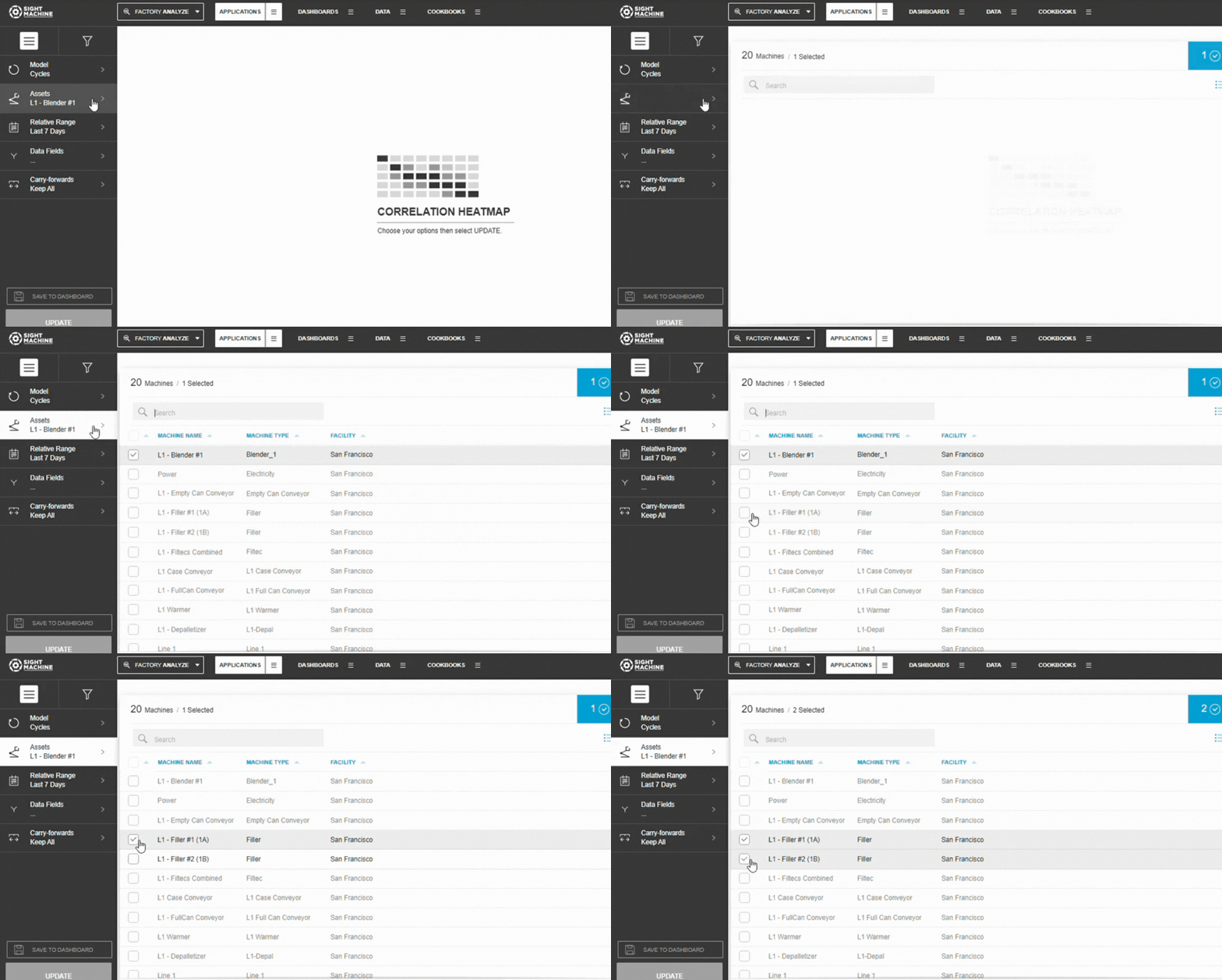
3. Choose Assets or Part Types
- Select Asset (Cycles) or Part Type (Parts)
- Choose one or multiple similar assets
📝 Note: Selecting multiple similar assets increases sample size, improving correlation reliability.
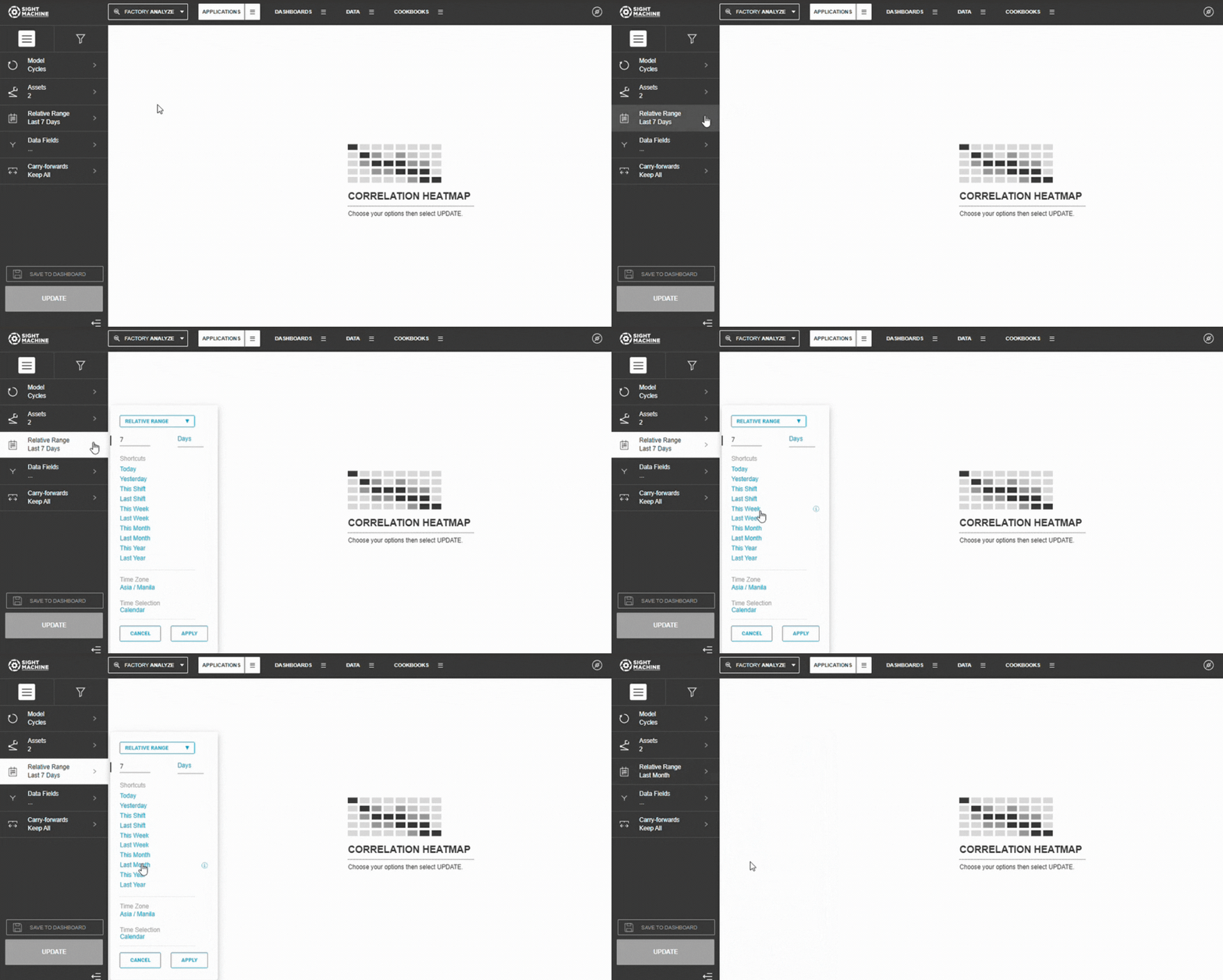
4. Set the Time Range
Choose from:
- Relative Ranges: Last 7/30/90 days
- Absolute Range: Specific start/end dates
⚠️ Warning: If the date range includes major process changes or downtime, correlations may be distorted.
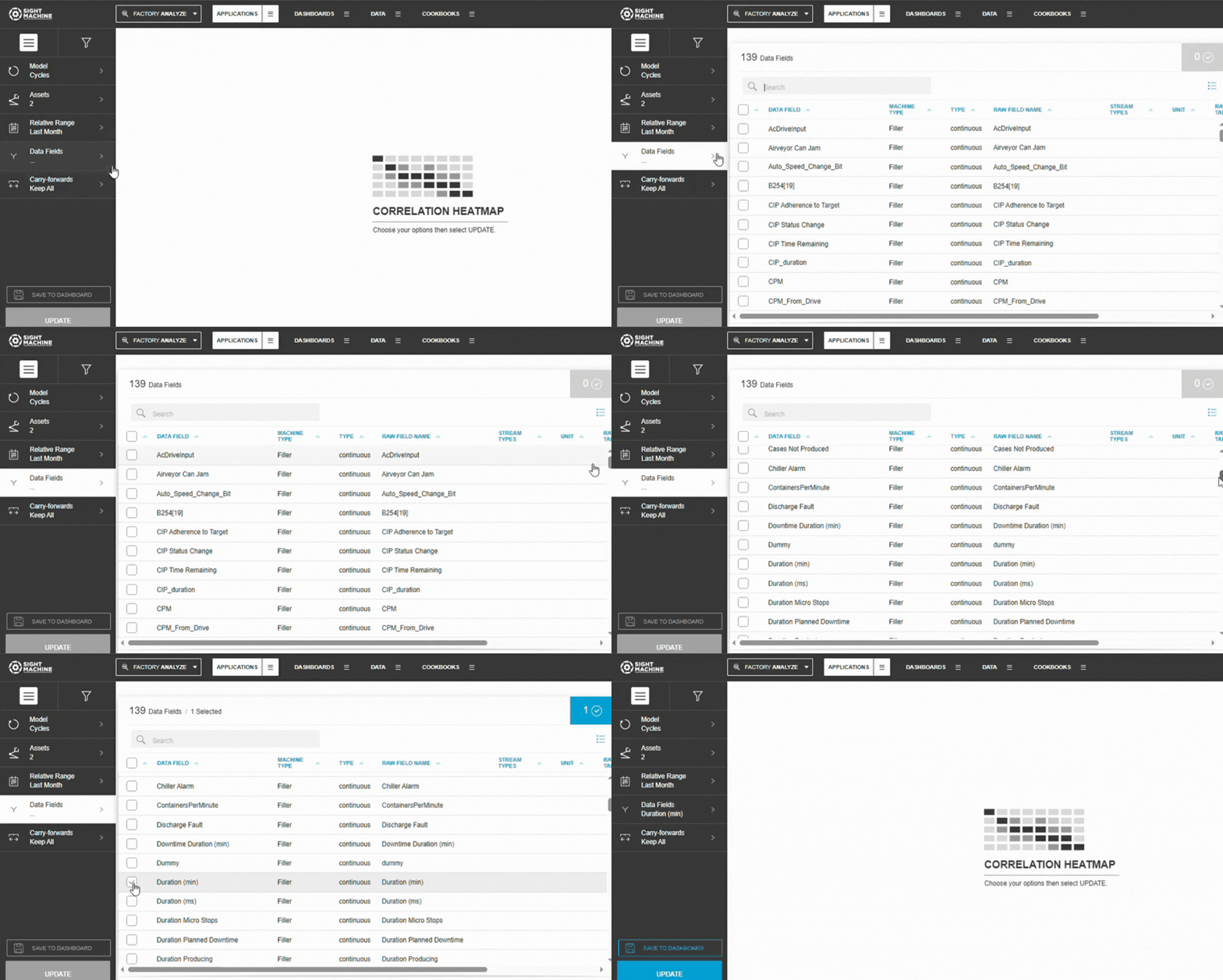
5. Select Parameters
- Select 3–10 numeric parameters
- Categorical fields are automatically filtered out
💡 Tip: Start with 5–7 parameters for clearer visual results.
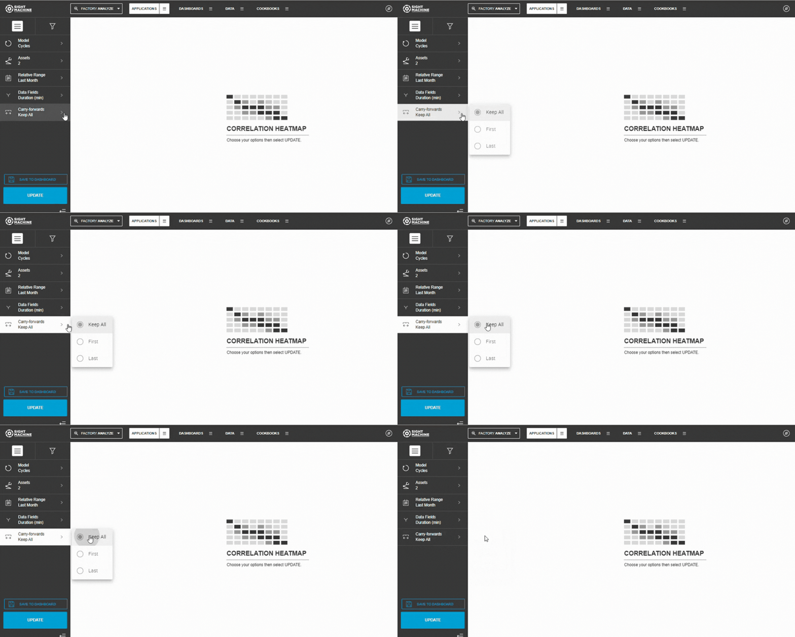
6. Configure Carry-Forwards
Choose how to handle forward-filled values:
- Keep All (default)
- First
- Last
7. Generate the Heatmap
- Select Update
- The heatmap calculates all correlations
- Results display in the matrix
8. Interpret the Heatmap
- Dark blue → strong positive correlation
- Dark red → strong negative correlation
- White/gray → weak or no correlation
💡 Tip:
Start by reviewing the darkest cells to identify the strongest parameter relationships.
Watch the full workflow here 👉

Tips, Notes, and Warnings
💡 Tip:
Use correlation findings to guide deeper analysis with Curve Fit or Time-Series Correlation.
📝 Note:
Parameters with very low variability often show weak correlations simply because they don’t change much.
⚠️ Warning:
Correlation ≠ causation. Always validate findings with process knowledge.
Practical Examples
Example 1
Process Parameter Exploration
Scenario: A food processing plant wants to understand relationships between temperature, pressure, humidity, cycle time, and energy consumption.
Configuration:
- Model: Cycles
- Assets: Sterilization_Unit_1, Sterilization_Unit_2
- Time Range: Last 60 days
- Parameters: Temperature, Pressure, Humidity, Cycle_Time, Energy_Consumption
Results (Correlation Matrix):
| Temperature | Pressure | Humidity | Cycle_Time | Energy | |
| Temperature | 1.00 | 0.88 | -0.12 | -0.74 | 0.92 |
| Pressure | 0.88 | 1.00 | -0.08 | -0.69 | 0.85 |
| Humidity | -0.12 | -0.08 | 1.00 | 0.15 | -0.18 |
| Cycle_Time | -0.74 | -0.69 | 0.15 | 1.00 | -0.71 |
| Energy | 0.92 | 0.85 | -0.18 | -0.71 | 1.00 |
Key Insights:
- Temperature and Energy are strongly correlated (0.92) → Higher temperatures increase energy consumption.
- Temperature and Pressure move together (0.88).
- Temperature and Cycle Time show a strong negative correlation (-0.74) → Higher temperatures shorten cycles.
- Humidity has weak relationships across the board.
Actions:
- Use Curve Fit Analysis to quantify temperature–energy impacts.
- Examine the temperature–cycle time relationship to optimize throughput.
- Confirm that humidity can be safely deprioritized.
Example 2
Quality Investigation
Scenario: An automotive parts manufacturer wants to understand which parameters are most associated with defect rate.
Configuration:
- Model: Parts
- Part Type: Brake_Rotor_A
- Time Range: Last 90 days
- Parameters: Defect_Rate, Material_Hardness, Pour_Temperature, Cooling_Rate, Mold_Pressure, Machine_Speed
Results (Top Correlations with Defect_Rate):
| Parameter Pair | Correlation |
| Defect_Rate ↔ Cooling_Rate | -0.81 |
| Defect_Rate ↔ Material_Hardness | -0.67 |
| Defect_Rate ↔ Mold_Pressure | 0.54 |
| Defect_Rate ↔ Pour_Temperature | -0.42 |
| Defect_Rate ↔ Machine_Speed | 0.38 |
Key Insights:
- Cooling Rate is the strongest factor (-0.81) → Faster cooling reduces defects.
- Material Hardness also plays a major role (-0.67).
- Mold Pressure shows a moderate positive correlation (0.54), which is unexpected and worth investigating.
- Speed and Pour Temperature show weaker relationships.
Actions:
- Immediately review mold pressure settings.
- Prioritize improvements in cooling rate control.
- Confirm material hardness targets with suppliers.
- Explore time-based correlation changes using Time-Series Correlation.
Example 3
Multicollinearity Detection for Model Building
Scenario: A data scientist wants to build a predictive model for yield and must avoid redundant predictors.
Configuration:
- Model: Cycles
- Assets: Reactor_A, Reactor_B, Reactor_C
- Time Range: Last 120 days
- Parameters: Yield, Temp_Sensor_1, Temp_Sensor_2, Pressure_A, Pressure_B, Flow_Rate, pH_Level, Catalyst_Amount
Results (Identifying Multicollinearity):
Highly correlated predictors:
- Temp_Sensor_1 ↔ Temp_Sensor_2: 0.97
- Pressure_A ↔ Pressure_B: 0.89
- Flow_Rate ↔ Catalyst_Amount: 0.78
Correlations with Yield:
- Temp_Sensor_1: 0.72
- Pressure_A: 0.65
- pH_Level: 0.58
- Catalyst_Amount: 0.51
Key Insights:
- Temperature sensors are nearly identical → Keep only one.
- Pressure measurements are also highly linked → Include only one.
- Flow_Rate and Catalyst_Amount overlap → Consider selecting one or creating a ratio.
Actions:
- Use Temp_Sensor_1, Pressure_A, pH_Level, and Catalyst_Amount (exclude their correlated counterparts).
- This reduces multicollinearity without losing meaningful information.
- Build and validate the predictive model with the selected inputs.
Calculation Method
Sight Machine uses the Pearson-R correlation coefficient to quantify linear relationships between pairs of continuous variables.
Pearson-R Correlation Coefficient
Range: -1.0 to +1.0
Interpretation:
- +1.0: Perfect positive relationship
- 0.0: No linear relationship
- -1.0: Perfect negative relationship
Mathematical Formula
r = (n × Σ(xy) - Σx × Σy) / √[(n × Σ(x²) - (Σx)²) × (n × Σ(y²) - (Σy)²)]
Definitions:
- n = number of observations
- Σ(xy) = sum of products
- Σx, Σy = sums
- Σ(x²), Σ(y²) = sums of squares
Alternative Formula (Mean-Centered)
r = Σ[(xi - x̄)(yi - ȳ)] / √[Σ(xi - x̄)² × Σ(yi - ȳ)²]
Both formulas produce the same result.
Covariance-Based Formula
r = Cov(X,Y) / (σx × σy)
Pearson-R normalizes covariance so results are always between −1 and +1.
How Correlation Heatmap Calculations Work
Step 1: Parameter Selection and Filtering
The tool identifies eligible fields:
- Includes: Continuous numeric fields
- Excludes: Categorical, textual, timestamp fields, and parameters marked excluded in the model
Users select 3–10 numeric parameters.
For N parameters, the heatmap computes N × (N−1) / 2 unique correlations.
Step 2: Data Retrieval and Preparation
The tool collects all cycles or parts matching:
- Selected assets or part types
- Date range
- Carry-forward configuration
Data is loaded into an observations × parameters table, missing values are flagged, and carry-forward rules applied.
Step 3: Pairwise Correlation Calculation
For each parameter pair:
- Identify observations where both values exist.
- Compute Σx, Σy, Σ(xy), Σ(x²), Σ(y²).
- Apply the Pearson-R formula.
- Store the coefficient and sample size.
Step 4: Matrix Population
The tool constructs a symmetric matrix with:
- Diagonal values = 1.00
- Off-diagonal values = Pearson-R coefficients
- Rows and columns aligned to selected parameter order
Step 5: Color Encoding
Color scale:
- Dark blue = strong positive
- Light blue = weak positive
- White/gray = near zero
- Light red = weak negative
- Dark red = strong negative
Color intensity increases with |r|.
Step 6: Summary Statistics
For each parameter, the tool computes:
- Count
- Standard deviation
- Minimum and maximum
- (Mean is used internally)
Step 7: Results Presentation
The interface displays:
- The color-coded matrix
- Numeric coefficients
- Summary statistics
- Interactive tooltips
Calculation Performance and Efficiency
Correlation count grows quadratically with parameter count.
Data is held in memory for performance (modern systems handle millions of rows easily).
Interpreting Correlation Strength
| Range | Interpretation |
| ≥0.7 | Strong |
| 0.5-0.7 | Moderate - Strong |
| 0.3-0.5 | Moderate |
| 0.1-0.3 | Weak |
| <0.1 | Very weak / None |
Positive correlations increase together; negative correlations move inversely.
Data Requirements
Parameters must be continuous numeric fields.
Up to 10 parameters can be analyzed at a time.
- Cycles model: Use when parameters come from the same asset type.
- Parts model: Use for part-level parameters across machines.
Date ranges can be absolute or relative.
Carry-forward handling can be included or excluded.
Understanding the Heatmap Matrix
The matrix is symmetric, with rows and columns representing parameters and each cell showing the pairwise correlation.
Summary Statistics
Each parameter includes:
- Count
- Standard deviation
- Minimum and maximum
These help assess data quality and variability.
Calculation Considerations
Pearson-R:
- Uses only valid pairs
- Ignores missing values
- Is scale-independent
- Captures linear relationships only
- May understate non-linear relationships
Common Use Cases
- Exploratory analysis
- Selecting parameters for modeling
- Understanding process behavior
- Root cause investigation
- Comparing time periods
Feature Benefits
- Simultaneous Multi-Parameter Exploration: Enables the exploration of relationships among many parameters at the same time, accelerating the discovery of complex or unexpected correlations within the dataset.
- Visual Root Cause Discovery: Helps efficiently pinpoint potential root causes by visually identifying how changes in input fields may influence output fields, supporting early-stage diagnostic analysis.
- Pearson-R Coefficient Matrix: Computes the Pearson-R correlation coefficient for up to 10 selected parameters, quantifying the strength and direction of every pairwise relationship in a clear matrix format.
- Multivariate Model Flexibility: Supports multivariate analysis on Cycle and Part data models, allowing users to tailor the scope of the analysis based on their data structure needs.
- High-Granularity Cycle Analysis: Allows investigation of parameters from the same machine type with high granularity when using the Cycle model, ensuring detailed operational insights.
- Cross-Machine Comparison Capability: Utilizes the Part model to facilitate comparison of fields across different machines, which is essential for understanding interactions in end-to-end production processes.
- Integrated Summary Statistics: Provides an immediate table of summary statistics (Count, Standard Deviation, Min, Max) for each selected parameter, offering essential contextual data alongside the correlation matrix.
- Foundation for Detailed Follow-Up: Acts as an ideal exploratory starting point that logically leads to deeper investigation using other tools, such as the Curve Fit Analysis, for validating identified pairs of interest.
Summary
The Correlation Heatmap tool displays a heatmap of the correlation coefficient between all possible pairs of parameters that are associated with the selected machine type. It provides you with a visualization of the nature of correlation using color (positive in blue or negative in red), and the magnitude of the relationship using intensity or hue.
The value of correlation is represented by the Pearson-R correlation coefficient displayed in each cell.
This is an excellent way for you to discover which parameters are correlated to each other.
